HTML code
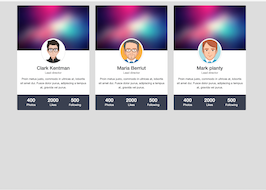
This is the html code used to create this bootstrap snippet, You can copy and paste the following html code inside a page with bootstrap 3.3.4 included, to get the result that you can see in the preview selection
Download<link href="https://maxcdn.bootstrapcdn.com/font-awesome/4.3.0/css/font-awesome.min.css" rel="stylesheet">
<div class="container bootdey">
<div class="row">
<div class="col-md-4">
<!-- START widget-->
<div class="panel widget">
<div class="half-float">
<img src="https://bootdey.com/img/Content/bg1.jpg" alt="" class="img-responsive">
<div class="half-float-bottom">
<img src="https://bootdey.com/img/Content/avatar/avatar7.png" alt="Image" class="img-thumbnail img-circle thumb128">
</div>
</div>
<div class="panel-body text-center">
<h3 class="m0">Clark Kentman</h3>
<p class="text-muted">Lead director</p>
<p>Proin metus justo, commodo in ultrices at, lobortis sit amet dui. Fusce dolor purus, adipiscing a tempus at, gravida vel purus.</p>
</div>
<div class="panel-body text-center bg-gray-dark">
<div class="row row-table">
<div class="col-xs-4">
<h3 class="m0">400</h3>
<p class="m0">Photos</p>
</div>
<div class="col-xs-4">
<h3 class="m0">2000</h3>
<p class="m0">Likes</p>
</div>
<div class="col-xs-4">
<h3 class="m0">500</h3>
<p class="m0">Following</p>
</div>
</div>
</div>
</div>
<!-- END widget-->
</div>
<div class="col-md-4">
<!-- START widget-->
<div class="panel widget">
<div class="half-float">
<img src="https://bootdey.com/img/Content/bg1.jpg" alt="" class="img-responsive">
<div class="half-float-bottom">
<img src="https://bootdey.com/img/Content/avatar/avatar1.png" alt="Image" class="img-thumbnail img-circle thumb128">
</div>
</div>
<div class="panel-body text-center">
<h3 class="m0">Maria Berriut</h3>
<p class="text-muted">Lead director</p>
<p>Proin metus justo, commodo in ultrices at, lobortis sit amet dui. Fusce dolor purus, adipiscing a tempus at, gravida vel purus.</p>
</div>
<div class="panel-body text-center bg-gray-dark">
<div class="row row-table">
<div class="col-xs-4">
<h3 class="m0">400</h3>
<p class="m0">Photos</p>
</div>
<div class="col-xs-4">
<h3 class="m0">2000</h3>
<p class="m0">Likes</p>
</div>
<div class="col-xs-4">
<h3 class="m0">500</h3>
<p class="m0">Following</p>
</div>
</div>
</div>
</div>
<!-- END widget-->
</div>
<div class="col-md-4">
<!-- START widget-->
<div class="panel widget">
<div class="half-float">
<img src="https://bootdey.com/img/Content/bg1.jpg" alt="" class="img-responsive">
<div class="half-float-bottom">
<img src="https://bootdey.com/img/Content/avatar/avatar6.png" alt="Image" class="img-thumbnail img-circle thumb128">
</div>
</div>
<div class="panel-body text-center">
<h3 class="m0">Mark planty</h3>
<p class="text-muted">Lead director</p>
<p>Proin metus justo, commodo in ultrices at, lobortis sit amet dui. Fusce dolor purus, adipiscing a tempus at, gravida vel purus.</p>
</div>
<div class="panel-body text-center bg-gray-dark">
<div class="row row-table">
<div class="col-xs-4">
<h3 class="m0">400</h3>
<p class="m0">Photos</p>
</div>
<div class="col-xs-4">
<h3 class="m0">2000</h3>
<p class="m0">Likes</p>
</div>
<div class="col-xs-4">
<h3 class="m0">500</h3>
<p class="m0">Following</p>
</div>
</div>
</div>
</div>
<!-- END widget-->
</div>
</div>
</div>CSS code
This is the css code used to create this bootstrap snippet, You can copy and paste the following css code inside a page with bootstrap 3.3.4 included, to get the result that you can see in the preview selection
Downloadbody {
font-family: "Helvetica Neue",Helvetica,Arial,sans-serif;
font-size: 14px;
line-height: 1.52857143;
color: #515253;
background-color: #ddd;
margin-top:20px;
}
.widget .panel, .widget.panel {
overflow: hidden;
}
.widget {
margin-bottom: 20px;
border: 0;
}
.bg-gray-darker {
background-color: #232735;
color: #fff!important;
}
.half-float {
position: relative;
margin-bottom: 65px;
}
.half-float .half-float-bottom, .half-float .half-float-top {
position: absolute;
left: 50%;
bottom: -60px;
width: 120px;
height: 120px;
margin-left: -60px;
z-index: 2;
}
.thumb128 {
width: 128px!important;
height: 128px!important;
}
.half-float+* {
margin-top: -55px;
padding-top: 65px;
}
.m0 {
margin: 0!important;
}
.bg-gray-dark {
background-color: #3a3f51;
color: #fff!important;
}
.row-table {
display: table;
table-layout: fixed;
height: 100%;
width: 100%;
margin: 0;
}
.row-table>[class*=col-] {
display: table-cell;
float: none;
table-layout: fixed;
vertical-align: middle;
}
About this bootstrap example/template
This example/template, users resume cards, was published on Jun 7th 2015, 13:01 by Bootdey Admin and it is free.
We hope you will enjoy this awesome snippet and stay tuned for the latest updates, bootdey snippets are already used in thousands of blogs, websites and projects. We believe it will save your precious time and gives trendy look to your next web project.
We always try to offer the best beautiful and responsive source of Bootstrap code examples and components.
This code example currectly have 11.7K views, Using this bootstrap snippet you have the following benefits:
Bootstrap 3.3.4
<link rel='stylesheet' href='https://netdna.bootstrapcdn.com/bootstrap/3.3.4/css/bootstrap.min.css'>
<script src='https://netdna.bootstrapcdn.com/bootstrap/3.3.4/js/bootstrap.min.js'></script>
This code example is based on bootstrap 3.3.4 and the grid system of this framework
Responsive
Based on bootstrap framework makes all the layouts perfectly responsive for all devices
Crossbrowser compatibility
Tested on all major browsers, it works smoothly on all of them
semantic html 5
Built on html / css3 the code quality is really amazing
Simple Integration
This code example can be simply integrated on existing sites and new ones too, all you need to do is copy the code and start working
