HTML code
This is the html code used to create this bootstrap snippet, You can copy and paste the following html code inside a page with bootstrap 4.4.1 included, to get the result that you can see in the preview selection
Download<div class="container">
<div class="row">
<div class="col-md-12">
<div class="card">
<div class="card-body">
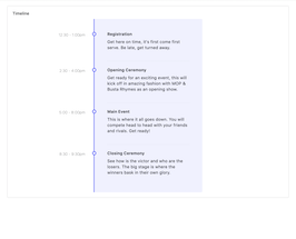
<h6 class="card-title">Timeline</h6>
<div id="content">
<ul class="timeline">
<li class="event" data-date="12:30 - 1:00pm">
<h3>Registration</h3>
<p>Get here on time, it's first come first serve. Be late, get turned away.</p>
</li>
<li class="event" data-date="2:30 - 4:00pm">
<h3>Opening Ceremony</h3>
<p>Get ready for an exciting event, this will kick off in amazing fashion with MOP & Busta Rhymes as an opening show.</p>
</li>
<li class="event" data-date="5:00 - 8:00pm">
<h3>Main Event</h3>
<p>This is where it all goes down. You will compete head to head with your friends and rivals. Get ready!</p>
</li>
<li class="event" data-date="8:30 - 9:30pm">
<h3>Closing Ceremony</h3>
<p>See how is the victor and who are the losers. The big stage is where the winners bask in their own glory.</p>
</li>
</ul>
</div>
</div>
</div>
</div>
</div>
</div>CSS code
This is the css code used to create this bootstrap snippet, You can copy and paste the following css code inside a page with bootstrap 4.4.1 included, to get the result that you can see in the preview selection
Downloadbody{margin-top:20px;}
.timeline {
border-left: 3px solid #727cf5;
border-bottom-right-radius: 4px;
border-top-right-radius: 4px;
background: rgba(114, 124, 245, 0.09);
margin: 0 auto;
letter-spacing: 0.2px;
position: relative;
line-height: 1.4em;
font-size: 1.03em;
padding: 50px;
list-style: none;
text-align: left;
max-width: 40%;
}
@media (max-width: 767px) {
.timeline {
max-width: 98%;
padding: 25px;
}
}
.timeline h1 {
font-weight: 300;
font-size: 1.4em;
}
.timeline h2,
.timeline h3 {
font-weight: 600;
font-size: 1rem;
margin-bottom: 10px;
}
.timeline .event {
border-bottom: 1px dashed #e8ebf1;
padding-bottom: 25px;
margin-bottom: 25px;
position: relative;
}
@media (max-width: 767px) {
.timeline .event {
padding-top: 30px;
}
}
.timeline .event:last-of-type {
padding-bottom: 0;
margin-bottom: 0;
border: none;
}
.timeline .event:before,
.timeline .event:after {
position: absolute;
display: block;
top: 0;
}
.timeline .event:before {
left: -207px;
content: attr(data-date);
text-align: right;
font-weight: 100;
font-size: 0.9em;
min-width: 120px;
}
@media (max-width: 767px) {
.timeline .event:before {
left: 0px;
text-align: left;
}
}
.timeline .event:after {
-webkit-box-shadow: 0 0 0 3px #727cf5;
box-shadow: 0 0 0 3px #727cf5;
left: -55.8px;
background: #fff;
border-radius: 50%;
height: 9px;
width: 9px;
content: "";
top: 5px;
}
@media (max-width: 767px) {
.timeline .event:after {
left: -31.8px;
}
}
.rtl .timeline {
border-left: 0;
text-align: right;
border-bottom-right-radius: 0;
border-top-right-radius: 0;
border-bottom-left-radius: 4px;
border-top-left-radius: 4px;
border-right: 3px solid #727cf5;
}
.rtl .timeline .event::before {
left: 0;
right: -170px;
}
.rtl .timeline .event::after {
left: 0;
right: -55.8px;
}
About this bootstrap example/template
This example/template, timeline events, was published on Mar 10th 2020, 14:09 by Bootdey Admin and it is free.
We hope you will enjoy this awesome snippet and stay tuned for the latest updates, bootdey snippets are already used in thousands of blogs, websites and projects. We believe it will save your precious time and gives trendy look to your next web project.
We always try to offer the best beautiful and responsive source of Bootstrap code examples and components.
This code example currectly have 60.1K views, Using this bootstrap snippet you have the following benefits:
Bootstrap 4.4.1
<link rel='stylesheet' href='https://cdn.jsdelivr.net/npm/[email protected]/dist/css/bootstrap.min.css'>
<script src='https://cdn.jsdelivr.net/npm/[email protected]/dist/js/bootstrap.bundle.min.js'></script>
This code example is based on bootstrap 4.4.1 and the grid system of this framework
Responsive
Based on bootstrap framework makes all the layouts perfectly responsive for all devices
Crossbrowser compatibility
Tested on all major browsers, it works smoothly on all of them
semantic html 5
Built on html / css3 the code quality is really amazing
Simple Integration
This code example can be simply integrated on existing sites and new ones too, all you need to do is copy the code and start working
