HTML code
This is the html code used to create this bootstrap snippet, You can copy and paste the following html code inside a page with bootstrap 4.4.1 included, to get the result that you can see in the preview selection
Download<div class="container-fluid">
<div class="row">
<div class="col-lg-12">
<div class="card">
<div class="card-body">
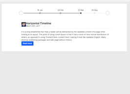
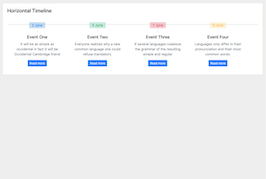
<h4 class="card-title mb-5">Horizontal Timeline</h4>
<div class="hori-timeline" dir="ltr">
<ul class="list-inline events">
<li class="list-inline-item event-list">
<div class="px-4">
<div class="event-date bg-soft-primary text-primary">2 June</div>
<h5 class="font-size-16">Event One</h5>
<p class="text-muted">It will be as simple as occidental in fact it will be Occidental Cambridge friend</p>
<div>
<a href="#" class="btn btn-primary btn-sm">Read more</a>
</div>
</div>
</li>
<li class="list-inline-item event-list">
<div class="px-4">
<div class="event-date bg-soft-success text-success">5 June</div>
<h5 class="font-size-16">Event Two</h5>
<p class="text-muted">Everyone realizes why a new common language one could refuse translators.</p>
<div>
<a href="#" class="btn btn-primary btn-sm">Read more</a>
</div>
</div>
</li>
<li class="list-inline-item event-list">
<div class="px-4">
<div class="event-date bg-soft-danger text-danger">7 June</div>
<h5 class="font-size-16">Event Three</h5>
<p class="text-muted">If several languages coalesce the grammar of the resulting simple and regular</p>
<div>
<a href="#" class="btn btn-primary btn-sm">Read more</a>
</div>
</div>
</li>
<li class="list-inline-item event-list">
<div class="px-4">
<div class="event-date bg-soft-warning text-warning">8 June</div>
<h5 class="font-size-16">Event Four</h5>
<p class="text-muted">Languages only differ in their pronunciation and their most common words.</p>
<div>
<a href="#" class="btn btn-primary btn-sm">Read more</a>
</div>
</div>
</li>
</ul>
</div>
</div>
</div>
<!-- end card -->
</div>
</div>
</div>
CSS code
This is the css code used to create this bootstrap snippet, You can copy and paste the following css code inside a page with bootstrap 4.4.1 included, to get the result that you can see in the preview selection
Downloadbody{
background:#eee;
margin-top:20px;
}
.hori-timeline .events {
border-top: 3px solid #e9ecef;
}
.hori-timeline .events .event-list {
display: block;
position: relative;
text-align: center;
padding-top: 70px;
margin-right: 0;
}
.hori-timeline .events .event-list:before {
content: "";
position: absolute;
height: 36px;
border-right: 2px dashed #dee2e6;
top: 0;
}
.hori-timeline .events .event-list .event-date {
position: absolute;
top: 38px;
left: 0;
right: 0;
width: 75px;
margin: 0 auto;
border-radius: 4px;
padding: 2px 4px;
}
@media (min-width: 1140px) {
.hori-timeline .events .event-list {
display: inline-block;
width: 24%;
padding-top: 45px;
}
.hori-timeline .events .event-list .event-date {
top: -12px;
}
}
.bg-soft-primary {
background-color: rgba(64,144,203,.3)!important;
}
.bg-soft-success {
background-color: rgba(71,189,154,.3)!important;
}
.bg-soft-danger {
background-color: rgba(231,76,94,.3)!important;
}
.bg-soft-warning {
background-color: rgba(249,213,112,.3)!important;
}
.card {
border: none;
margin-bottom: 24px;
-webkit-box-shadow: 0 0 13px 0 rgba(236,236,241,.44);
box-shadow: 0 0 13px 0 rgba(236,236,241,.44);
}
About this bootstrap example/template
This example/template, simple horizontal timeline, was published on Jun 2nd 2020, 09:34 by Bootdey Admin and it is free.
We hope you will enjoy this awesome snippet and stay tuned for the latest updates, bootdey snippets are already used in thousands of blogs, websites and projects. We believe it will save your precious time and gives trendy look to your next web project.
We always try to offer the best beautiful and responsive source of Bootstrap code examples and components.
This code example currectly have 61.6K views, Using this bootstrap snippet you have the following benefits:
Bootstrap 4.4.1
<link rel='stylesheet' href='https://cdn.jsdelivr.net/npm/[email protected]/dist/css/bootstrap.min.css'>
<script src='https://cdn.jsdelivr.net/npm/[email protected]/dist/js/bootstrap.bundle.min.js'></script>
This code example is based on bootstrap 4.4.1 and the grid system of this framework
Responsive
Based on bootstrap framework makes all the layouts perfectly responsive for all devices
Crossbrowser compatibility
Tested on all major browsers, it works smoothly on all of them
semantic html 5
Built on html / css3 the code quality is really amazing
Simple Integration
This code example can be simply integrated on existing sites and new ones too, all you need to do is copy the code and start working
