HTML code
This is the html code used to create this bootstrap snippet, You can copy and paste the following html code inside a page with bootstrap 5.1.3 included, to get the result that you can see in the preview selection
Download<div class="container">
<div class="text-center mb-5">
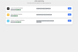
<h3>Jobs openning</h3>
<p class="lead">Eros ante urna tortor aliquam nisl magnis quisque hac</p>
</div>
<div class="card mb-3">
<div class="card-body">
<div class="d-flex flex-column flex-lg-row">
<span class="avatar avatar-text rounded-3 me-4 mb-2">FD</span>
<div class="row flex-fill">
<div class="col-sm-5">
<h4 class="h5">Junior Frontend Developer</h4>
<span class="badge bg-secondary">WORLDWIDE</span> <span class="badge bg-success">$60K - $100K</span>
</div>
<div class="col-sm-4 py-2">
<span class="badge bg-secondary">REACT</span>
<span class="badge bg-secondary">NODE</span>
<span class="badge bg-secondary">TYPESCRIPT</span>
<span class="badge bg-secondary">JUNIOR</span>
</div>
<div class="col-sm-3 text-lg-end">
<a href="#" class="btn btn-primary stretched-link">Apply</a>
</div>
</div>
</div>
</div>
</div>
<div class="card mb-3">
<div class="card-body">
<div class="d-flex flex-column flex-lg-row">
<span class="avatar avatar-text rounded-3 me-4 bg-warning mb-2">BE</span>
<div class="row flex-fill">
<div class="col-sm-5">
<h4 class="h5">Senior Backend Engineer</h4>
<span class="badge bg-secondary">US</span> <span class="badge bg-success">$90K - $180K</span>
</div>
<div class="col-sm-4 py-2">
<span class="badge bg-secondary">GOLANG</span>
<span class="badge bg-secondary">SENIOR</span>
<span class="badge bg-secondary">ENGINEER</span>
<span class="badge bg-secondary">BACKEND</span>
</div>
<div class="col-sm-3 text-lg-end">
<a href="#" class="btn btn-primary stretched-link">Apply</a>
</div>
</div>
</div>
</div>
</div>
<div class="card mb-3">
<div class="card-body">
<div class="d-flex flex-column flex-lg-row">
<span class="avatar avatar-text rounded-3 me-4 bg-info mb-2">PM</span>
<div class="row flex-fill">
<div class="col-sm-5">
<h4 class="h5">Director of Product Marketing</h4>
<span class="badge bg-secondary">WORLDWIDE</span> <span class="badge bg-success">$150K - $210K</span>
</div>
<div class="col-sm-4 py-2">
<span class="badge bg-secondary">PRODUCT MARKETING</span>
<span class="badge bg-secondary">MARKETING</span>
<span class="badge bg-secondary">EXECUTIVE</span>
<span class="badge bg-secondary">ECOMMERCE</span>
</div>
<div class="col-sm-3 text-lg-end">
<a href="#" class="btn btn-primary stretched-link">Apply</a>
</div>
</div>
</div>
</div>
</div>
</div>CSS code
This is the css code used to create this bootstrap snippet, You can copy and paste the following css code inside a page with bootstrap 5.1.3 included, to get the result that you can see in the preview selection
Downloadbody{
background:#eee;
}
.card {
box-shadow: 0 20px 27px 0 rgb(0 0 0 / 5%);
}
.card {
position: relative;
display: flex;
flex-direction: column;
min-width: 0;
word-wrap: break-word;
background-color: #fff;
background-clip: border-box;
border: 0 solid rgba(0,0,0,.125);
border-radius: 1rem;
}
.card-body {
-webkit-box-flex: 1;
-ms-flex: 1 1 auto;
flex: 1 1 auto;
padding: 1.5rem 1.5rem;
}
.avatar-text {
display: -webkit-box;
display: -ms-flexbox;
display: flex;
-webkit-box-pack: center;
-ms-flex-pack: center;
justify-content: center;
-webkit-box-align: center;
-ms-flex-align: center;
align-items: center;
background: #000;
color: #fff;
font-weight: 700;
}
.avatar {
width: 3rem;
height: 3rem;
}
.rounded-3 {
border-radius: 0.5rem!important;
}
.mb-2 {
margin-bottom: 0.5rem!important;
}
.me-4 {
margin-right: 1.5rem!important;
}
About this bootstrap example/template
This example/template, simple Jobs openning list, was published on Jan 31st 2022, 08:43 by Bootdey Admin and it is free.
We hope you will enjoy this awesome snippet and stay tuned for the latest updates, bootdey snippets are already used in thousands of blogs, websites and projects. We believe it will save your precious time and gives trendy look to your next web project.
We always try to offer the best beautiful and responsive source of Bootstrap code examples and components.
This code example currectly have 15.5K views, Using this bootstrap snippet you have the following benefits:
Bootstrap 5.1.3
<link rel='stylesheet' href='https://cdn.jsdelivr.net/npm/[email protected]/dist/css/bootstrap.min.css'>
<script src='https://cdn.jsdelivr.net/npm/[email protected]/dist/js/bootstrap.bundle.min.js'></script>
This code example is based on bootstrap 5.1.3 and the grid system of this framework
Responsive
Based on bootstrap framework makes all the layouts perfectly responsive for all devices
Crossbrowser compatibility
Tested on all major browsers, it works smoothly on all of them
semantic html 5
Built on html / css3 the code quality is really amazing
Simple Integration
This code example can be simply integrated on existing sites and new ones too, all you need to do is copy the code and start working
