HTML code
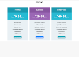
This is the html code used to create this bootstrap snippet, You can copy and paste the following html code inside a page with bootstrap 4.5.0 included, to get the result that you can see in the preview selection
Download<section id="pricing" class="bg-white">
<div class="container">
<h2 class="text-center">PRICING</h2>
<div class="spacer spacer-line border-primary"> </div>
<div class="spacer"> </div>
<div class="row">
<div class="col-md-4">
<div class="pricing-table">
<div class="pricing-table-title">
<h5 class="pricing-title bg-info-hover text-white">STARTER</h5>
</div>
<div class="pricing-table-price text-center bg-info">
<p class="title-font">
<span class="pricing-period text-white mr-1">From</span>
<span class="pricing-currency text-white">$</span>
<span class="pricing-price text-white">9.99</span>
<span class="pricing-period text-white">/ Mo.</span>
</p>
</div>
<div class="pricing-table-content">
<ul>
<li><strong>Basic Package</strong></li>
<li><strong>1 Intermediate</strong></li>
<li><strong>Business Start</strong></li>
<li><strong><del>Professional Features</del></strong></li>
<li><strong><del>Extra Options</del></strong></li>
<li><strong>24/7 Support</strong></li>
</ul>
<div class="pricing-table-button">
<a href="#x" class="btn btn-info"><span>Request Quote</span></a>
</div><!-- / pricing-table-button -->
</div><!-- / pricing-table-content -->
</div><!-- / pricing-table -->
</div><!-- / column -->
<div class="col-md-4">
<div class="pricing-table bg-lightgrey">
<div class="pricing-table-title">
<h5 class="pricing-title bg-primary-hover text-white">BUSINESS</h5>
</div>
<div class="pricing-table-price text-center bg-primary">
<p class="title-font">
<span class="pricing-period text-white mr-1">From</span>
<span class="pricing-currency text-white">$</span>
<span class="pricing-price text-white">29.99</span>
<span class="pricing-period text-white">/ Mo.</span>
</p>
</div>
<div class="pricing-table-content">
<ul>
<li><strong>Management Package</strong></li>
<li><strong>1 Professional</strong></li>
<li><strong>Business Professional</strong></li>
<li><strong>Professional Features</strong></li>
<li><strong><del>Extra Options</del></strong></li>
<li><strong>24/7 Support</strong></li>
</ul>
<div class="pricing-table-button">
<a href="#x" class="btn btn-primary"><span>Request Quote</span></a>
</div><!-- / pricing-table-button -->
</div><!-- / pricing-table-content -->
</div><!-- / pricing-table -->
</div><!-- / column -->
<div class="col-md-4">
<div class="pricing-table">
<div class="pricing-table-title">
<h5 class="pricing-title bg-info-hover text-white">ENTERPRISE</h5>
</div>
<div class="pricing-table-price text-center bg-info">
<p class="title-font">
<span class="pricing-period text-white mr-1">From</span>
<span class="pricing-currency text-white">$</span>
<span class="pricing-price text-white">49.99</span>
<span class="pricing-period text-white">/ Mo.</span>
</p>
</div>
<div class="pricing-table-content">
<ul>
<li><strong>Business Package</strong></li>
<li><strong>Up to 4 Professionals</strong></li>
<li><strong>Enterprise Professional</strong></li>
<li><strong>Professional Features</strong></li>
<li><strong>Extra Options</strong></li>
<li><strong>24/7 Support</strong></li>
</ul>
<div class="pricing-table-button">
<a href="#x" class="btn btn-info"><span>Request Quote</span></a>
</div><!-- / pricing-table-button -->
</div><!-- / pricing-table-content -->
</div><!-- / pricing-table -->
</div><!-- / column -->
</div><!-- / row -->
</div><!-- / container -->
</section>CSS code
This is the css code used to create this bootstrap snippet, You can copy and paste the following css code inside a page with bootstrap 4.5.0 included, to get the result that you can see in the preview selection
Downloadbody{
background-color: #f7f7f7;
margin-top:20px;}
/* pricing tables */
.pricing-table {
background: #e9f0f4;
text-align: center;
margin: 15px 0;
}
.pricing-table ul, .pricing-table ol {
margin-bottom: 0;
padding-left: 0;
}
.pricing-title {
font-size: 1.5rem;
font-weight: 700;
padding: 30px;
margin-bottom: 0;
}
.pricing-table-price {
background: #cdd4d8;
font-weight: 700;
padding: 30px;
margin-bottom: 30px;
}
.pricing-table-price.w-rounded-price {
display: table;
width: 150px;
height: 150px;
border-radius: 50%;
margin: 0 auto 30px auto;
padding: 0;
}
.rounded-price {
display: table-cell;
text-align: center;
vertical-align: middle;
}
.rounded-price .pricing-price {
font-size: 1.75rem;
}
.rounded-price .pricing-currency {
vertical-align: 10px;
}
.pricing-table-price p {
color: #000;
margin-bottom: 0;
}
.pricing-currency {
font-size: 1rem;
font-weight: 700;
vertical-align: 25px;
}
.pricing-price {
font-size: 3rem;
font-weight: 700;
}
.pricing-period {
font-weight: 700;
}
.pricing-table-content li {
margin-bottom: 15px;
}
.pricing-table-button {
padding: 15px 0 35px;
}
.featured.pricing-table {
background: #9c64b8;
}
.featured.pricing-table .pricing-title {
color: #fff;
}
.featured.pricing-table .pricing-table-content ul li {
color: #eee;
}
.featured.pricing-table .pricing-table-price {
background: #8853a1;
}
.featured.pricing-table .pricing-table-price p {
color: #fff;
}
ul {
list-style: none;
padding: 0;
}
.bg-info-hover {
background-color: #1397af !important;
}
.bg-info {
background-color: #21b9d5 !important;
}
.bg-primary-hover {
background-color: #8853a1 !important;
}
.bg-primary {
background-color: #9c64b8 !important;
}
.text-white {
color: #fff !important;
}
About this bootstrap example/template
This example/template, pricing section, was published on Aug 11th 2020, 15:04 by Bootdey Admin and it is free.
We hope you will enjoy this awesome snippet and stay tuned for the latest updates, bootdey snippets are already used in thousands of blogs, websites and projects. We believe it will save your precious time and gives trendy look to your next web project.
We always try to offer the best beautiful and responsive source of Bootstrap code examples and components.
This code example currectly have 7.7K views, Using this bootstrap snippet you have the following benefits:
Bootstrap 4.5.0
<link rel='stylesheet' href='https://cdn.jsdelivr.net/npm/[email protected]/dist/css/bootstrap.min.css'>
<script src='https://cdn.jsdelivr.net/npm/[email protected]/dist/js/bootstrap.bundle.min.js'></script>
This code example is based on bootstrap 4.5.0 and the grid system of this framework
Responsive
Based on bootstrap framework makes all the layouts perfectly responsive for all devices
Crossbrowser compatibility
Tested on all major browsers, it works smoothly on all of them
semantic html 5
Built on html / css3 the code quality is really amazing
Simple Integration
This code example can be simply integrated on existing sites and new ones too, all you need to do is copy the code and start working
