HTML code
This is the html code used to create this bootstrap snippet, You can copy and paste the following html code inside a page with bootstrap 4.4.1 included, to get the result that you can see in the preview selection
Download<link rel="stylesheet" href="https://cdnjs.cloudflare.com/ajax/libs/ionicons/4.2.0/css/ionicons.min.css" integrity="sha256-F3Xeb7IIFr1QsWD113kV2JXaEbjhsfpgrKkwZFGIA4E=" crossorigin="anonymous" />
<div class="container-fluid">
<!-- Row -->
<div class="row">
<div class="col-xl-12 pa-0">
<div class="faq-search-wrap bg-teal-light-3">
<div class="container">
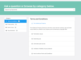
<h1 class="display-5 text-white mb-20">Ask a question or browse by category below.</h1>
<div class="form-group w-100 mb-0">
<div class="input-group">
<input class="form-control form-control-lg filled-input bg-white" placeholder="Search by keywords" type="text">
<div class="input-group-append">
<span class="input-group-text"><span class="feather-icon"><svg xmlns="http://www.w3.org/2000/svg" width="24" height="24" viewBox="0 0 24 24" fill="none" stroke="currentColor" stroke-width="2" stroke-linecap="round" stroke-linejoin="round" class="feather feather-arrow-right"><line x1="5" y1="12" x2="19" y2="12"></line><polyline points="12 5 19 12 12 19"></polyline></svg></span></span>
</div>
</div>
</div>
</div>
</div>
<div class="container mt-sm-60 mt-30">
<div class="hk-row">
<div class="col-xl-4">
<div class="card">
<h6 class="card-header">
Category
</h6>
<ul class="list-group list-group-flush">
<li class="list-group-item d-flex align-items-center active">
<i class="ion ion-md-sunny mr-15"></i>Terms & conditions<span class="badge badge-light badge-pill ml-15">06</span>
</li>
<li class="list-group-item d-flex align-items-center">
<i class="ion ion-md-unlock mr-15"></i>Privacy policy<span class="badge badge-light badge-pill ml-15">14</span>
</li>
<li class="list-group-item d-flex align-items-center">
<i class="ion ion-md-bookmark mr-15"></i>Terms of use<span class="badge badge-light badge-pill ml-15">10</span>
</li>
<li class="list-group-item d-flex align-items-center">
<i class="ion ion-md-filing mr-15"></i>Documentation<span class="badge badge-light badge-pill ml-15">27</span>
</li>
</ul>
</div>
</div>
<div class="col-xl-8">
<div class="card card-lg">
<h3 class="card-header border-bottom-0">
Terms and Conditions
</h3>
<div class="accordion accordion-type-2 accordion-flush" id="accordion_2">
<div class="card">
<div class="card-header d-flex justify-content-between activestate">
<a role="button" data-toggle="collapse" href="#collapse_1i" aria-expanded="true">The Intellectual Property</a>
</div>
<div id="collapse_1i" class="collapse show" data-parent="#accordion_2" role="tabpanel">
<div class="card-body pa-15">The Intellectual Property disclosure will inform users that the contents, logo and other visual media you created is your property and is protected by copyright laws.</div>
</div>
</div>
<div class="card">
<div class="card-header d-flex justify-content-between">
<a class="collapsed" role="button" data-toggle="collapse" href="#collapse_2i" aria-expanded="false">Termination clause</a>
</div>
<div id="collapse_2i" class="collapse" data-parent="#accordion_2">
<div class="card-body pa-15">A Termination clause will inform that users’ accounts on your website and mobile app or users’ access to your website and mobile (if users can’t have an account with you) can be terminated in case of abuses or at your sole discretion.</div>
</div>
</div>
<div class="card">
<div class="card-header d-flex justify-content-between">
<a class="collapsed" role="button" data-toggle="collapse" href="#collapse_3i" aria-expanded="false">Governing Law</a>
</div>
<div id="collapse_3i" class="collapse" data-parent="#accordion_2">
<div class="card-body pa-15">A Governing Law will inform users which laws govern the agreement. This should the country in which your company is headquartered or the country from which you operate your website and mobile app.</div>
</div>
</div>
<div class="card">
<div class="card-header d-flex justify-content-between">
<a class="collapsed" role="button" data-toggle="collapse" href="#collapse_4i" aria-expanded="false">Limit what users can do</a>
</div>
<div id="collapse_4i" class="collapse" data-parent="#accordion_2">
<div class="card-body pa-15">A Limit What Users Can Do clause can inform users that by agreeing to use your service, they’re also agreeing to not do certain things. This can be part of a very long and thorough list in your Terms and Conditions agreements so as to encompass the most amount of negative uses.</div>
</div>
</div>
<div class="card">
<div class="card-header d-flex justify-content-between">
<a class="collapsed" role="button" data-toggle="collapse" href="#collapse_5i" aria-expanded="false">Limitation of liability of your products</a>
</div>
<div id="collapse_5i" class="collapse" data-parent="#accordion_2">
<div class="card-body pa-15">No matter what kind of goods you sell, best practices direct you to present any warranties you are disclaiming and liabilities you are limiting in a way that your customers will notice.</div>
</div>
</div>
<div class="card">
<div class="card-header d-flex justify-content-between">
<a class="collapsed" role="button" data-toggle="collapse" href="#collapse_6i" aria-expanded="false">How to enforce Terms and Conditions</a>
</div>
<div id="collapse_6i" class="collapse" data-parent="#accordion_2">
<div class="card-body pa-15">While creating and having a Terms and Conditions is important, it’s far more important to understand how you can make the Terms and Conditions enforceable. You should always use clickwrap to get users to agree to your Terms and Conditions. Clickwrap is when you make your users take some action – typically clicking something – to show they’re agreeing. Here’s how Engine Yard uses the clickwrap agreement with the I agree check box:</div>
</div>
</div>
</div>
</div>
</div>
</div>
</div>
</div>
</div>
<!-- /Row -->
</div>CSS code
This is the css code used to create this bootstrap snippet, You can copy and paste the following css code inside a page with bootstrap 4.4.1 included, to get the result that you can see in the preview selection
Downloadbody{
background:#f5f5f6;
margin-top:20px;
}
/*Faq*/
.faq-search-wrap {
padding: 50px 0 60px;
}
.faq-search-wrap .form-group .form-control,
.faq-search-wrap .form-group .dd-handle {
border-top-right-radius: .25rem;
border-bottom-right-radius: .25rem;
}
.faq-search-wrap .form-group .input-group-append {
position: absolute;
right: 0;
top: 0;
bottom: 0;
z-index: 10;
pointer-events: none;
}
.faq-search-wrap .form-group .input-group-append .input-group-text {
background: transparent;
border: none;
}
.faq-search-wrap .form-group .input-group-append .input-group-text .feather-icon > svg {
height: 18px;
width: 18px;
}
.bg-teal-light-3 {
background-color: #7fcdc1 !important;
}
.hk-row {
display: -ms-flexbox;
display: flex;
-ms-flex-wrap: wrap;
flex-wrap: wrap;
margin-right: -10px;
margin-left: -10px;
}
@media (min-width: 576px){
.mt-sm-60 {
margin-top: 60px !important;
}
}
.mt-30 {
margin-top: 30px !important;
}
.list-group-item.active {
background-color: #00acf0;
border-color: #00acf0;
}
.accordion .card .card-header.activestate {
border-width: 1px;
}
.accordion .card .card-header {
padding: 0;
border-width: 0;
}
.card.card-lg .card-header, .card.card-lg .card-footer {
padding: .9rem 1.5rem;
}
.accordion>.card .card-header {
margin-bottom: -1px;
}
.card .card-header {
background: transparent;
border: none;
}
.accordion.accordion-type-2 .card .card-header > a.collapsed {
color: #324148;
}
.accordion .card:first-of-type .card-header:first-child > a {
border-top-left-radius: calc(.25rem - 1px);
border-top-right-radius: calc(.25rem - 1px);
}
.accordion.accordion-type-2 .card .card-header > a {
background: transparent;
color: #00acf0;
padding-left: 50px;
}
.accordion .card .card-header > a.collapsed {
color: #324148;
background: transparent;
}
.accordion .card .card-header > a {
background: #00acf0;
color: #fff;
font-weight: 500;
padding: .75rem 1.25rem;
display: block;
width: 100%;
text-align: left;
position: relative;
-webkit-transition: all 0.2s ease-in-out;
-moz-transition: all 0.2s ease-in-out;
transition: all 0.2s ease-in-out;
}
a {
text-decoration: none;
color: #00acf0;
-webkit-transition: color 0.2s ease;
-moz-transition: color 0.2s ease;
transition: color 0.2s ease;
}
.badge.badge-pill {
border-radius: 50px;
}
.badge.badge-light {
background: #eaecec;
color: #324148;
}
.badge {
font-weight: 500;
border-radius: 4px;
padding: 5px 7px;
font-size: 72%;
letter-spacing: 0.3px;
vertical-align: middle;
display: inline-block;
text-align: center;
text-transform: capitalize;
}
.ml-15 {
margin-left: 15px !important;
}
.accordion.accordion-type-2 .card .card-header > a.collapsed:after {
content: "\f158";
}
.accordion.accordion-type-2 .card .card-header > a::after {
display: inline-block;
font: normal normal normal 14px/1 'Ionicons';
speak: none;
text-transform: none;
line-height: 1;
-webkit-font-smoothing: antialiased;
-moz-osx-font-smoothing: grayscale;
text-rendering: auto;
position: absolute;
content: "\f176";
font-size: 21px;
top: 15px;
left: 20px;
}
.mr-15 {
margin-right: 15px !important;
}
About this bootstrap example/template
This example/template, paq page, was published on Feb 25th 2020, 14:13 by Bootdey Admin and it is free.
We hope you will enjoy this awesome snippet and stay tuned for the latest updates, bootdey snippets are already used in thousands of blogs, websites and projects. We believe it will save your precious time and gives trendy look to your next web project.
We always try to offer the best beautiful and responsive source of Bootstrap code examples and components.
This code example currectly have 25.8K views, Using this bootstrap snippet you have the following benefits:
Bootstrap 4.4.1
<link rel='stylesheet' href='https://cdn.jsdelivr.net/npm/[email protected]/dist/css/bootstrap.min.css'>
<script src='https://cdn.jsdelivr.net/npm/[email protected]/dist/js/bootstrap.bundle.min.js'></script>
This code example is based on bootstrap 4.4.1 and the grid system of this framework
Responsive
Based on bootstrap framework makes all the layouts perfectly responsive for all devices
Crossbrowser compatibility
Tested on all major browsers, it works smoothly on all of them
semantic html 5
Built on html / css3 the code quality is really amazing
Simple Integration
This code example can be simply integrated on existing sites and new ones too, all you need to do is copy the code and start working
