HTML code
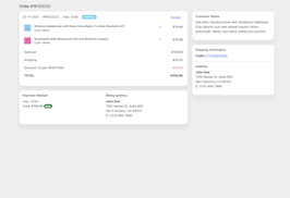
This is the html code used to create this bootstrap snippet, You can copy and paste the following html code inside a page with bootstrap 5.1.3 included, to get the result that you can see in the preview selection
Download<div class="container-fluid">
<div class="container">
<!-- Title -->
<div class="d-flex justify-content-between align-items-center py-3">
<h2 class="h5 mb-0"><a href="#" class="text-muted"></a> Order #16123222</h2>
</div>
<!-- Main content -->
<div class="row">
<div class="col-lg-8">
<!-- Details -->
<div class="card mb-4">
<div class="card-body">
<div class="mb-3 d-flex justify-content-between">
<div>
<span class="me-3">22-11-2021</span>
<span class="me-3">#16123222</span>
<span class="me-3">Visa -1234</span>
<span class="badge rounded-pill bg-info">SHIPPING</span>
</div>
<div class="d-flex">
<button class="btn btn-link p-0 me-3 d-none d-lg-block btn-icon-text"><i class="bi bi-download"></i> <span class="text">Invoice</span></button>
<div class="dropdown">
<button class="btn btn-link p-0 text-muted" type="button" data-bs-toggle="dropdown">
<i class="bi bi-three-dots-vertical"></i>
</button>
<ul class="dropdown-menu dropdown-menu-end">
<li><a class="dropdown-item" href="#"><i class="bi bi-pencil"></i> Edit</a></li>
<li><a class="dropdown-item" href="#"><i class="bi bi-printer"></i> Print</a></li>
</ul>
</div>
</div>
</div>
<table class="table table-borderless">
<tbody>
<tr>
<td>
<div class="d-flex mb-2">
<div class="flex-shrink-0">
<img src="https://www.bootdey.com/image/280x280/87CEFA/000000" alt="" width="35" class="img-fluid">
</div>
<div class="flex-lg-grow-1 ms-3">
<h6 class="small mb-0"><a href="#" class="text-reset">Wireless Headphones with Noise Cancellation Tru Bass Bluetooth HiFi</a></h6>
<span class="small">Color: Black</span>
</div>
</div>
</td>
<td>1</td>
<td class="text-end">$79.99</td>
</tr>
<tr>
<td>
<div class="d-flex mb-2">
<div class="flex-shrink-0">
<img src="https://www.bootdey.com/image/280x280/FF69B4/000000" alt="" width="35" class="img-fluid">
</div>
<div class="flex-lg-grow-1 ms-3">
<h6 class="small mb-0"><a href="#" class="text-reset">Smartwatch IP68 Waterproof GPS and Bluetooth Support</a></h6>
<span class="small">Color: White</span>
</div>
</div>
</td>
<td>1</td>
<td class="text-end">$79.99</td>
</tr>
</tbody>
<tfoot>
<tr>
<td colspan="2">Subtotal</td>
<td class="text-end">$159,98</td>
</tr>
<tr>
<td colspan="2">Shipping</td>
<td class="text-end">$20.00</td>
</tr>
<tr>
<td colspan="2">Discount (Code: NEWYEAR)</td>
<td class="text-danger text-end">-$10.00</td>
</tr>
<tr class="fw-bold">
<td colspan="2">TOTAL</td>
<td class="text-end">$169,98</td>
</tr>
</tfoot>
</table>
</div>
</div>
<!-- Payment -->
<div class="card mb-4">
<div class="card-body">
<div class="row">
<div class="col-lg-6">
<h3 class="h6">Payment Method</h3>
<p>Visa -1234 <br>
Total: $169,98 <span class="badge bg-success rounded-pill">PAID</span></p>
</div>
<div class="col-lg-6">
<h3 class="h6">Billing address</h3>
<address>
<strong>John Doe</strong><br>
1355 Market St, Suite 900<br>
San Francisco, CA 94103<br>
<abbr title="Phone">P:</abbr> (123) 456-7890
</address>
</div>
</div>
</div>
</div>
</div>
<div class="col-lg-4">
<!-- Customer Notes -->
<div class="card mb-4">
<div class="card-body">
<h3 class="h6">Customer Notes</h3>
<p>Sed enim, faucibus litora velit vestibulum habitasse. Cras lobortis cum sem aliquet mauris rutrum. Sollicitudin. Morbi, sem tellus vestibulum porttitor.</p>
</div>
</div>
<div class="card mb-4">
<!-- Shipping information -->
<div class="card-body">
<h3 class="h6">Shipping Information</h3>
<strong>FedEx</strong>
<span><a href="#" class="text-decoration-underline" target="_blank">FF1234567890</a> <i class="bi bi-box-arrow-up-right"></i> </span>
<hr>
<h3 class="h6">Address</h3>
<address>
<strong>John Doe</strong><br>
1355 Market St, Suite 900<br>
San Francisco, CA 94103<br>
<abbr title="Phone">P:</abbr> (123) 456-7890
</address>
</div>
</div>
</div>
</div>
</div>
</div>CSS code
This is the css code used to create this bootstrap snippet, You can copy and paste the following css code inside a page with bootstrap 5.1.3 included, to get the result that you can see in the preview selection
Downloadbody{
background:#eee;
}
.card {
box-shadow: 0 20px 27px 0 rgb(0 0 0 / 5%);
}
.card {
position: relative;
display: flex;
flex-direction: column;
min-width: 0;
word-wrap: break-word;
background-color: #fff;
background-clip: border-box;
border: 0 solid rgba(0,0,0,.125);
border-radius: 1rem;
}
.text-reset {
--bs-text-opacity: 1;
color: inherit!important;
}
a {
color: #5465ff;
text-decoration: none;
}
About this bootstrap example/template
This example/template, order details, was published on Jan 31st 2022, 08:30 by Bootdey Admin and it is free.
We hope you will enjoy this awesome snippet and stay tuned for the latest updates, bootdey snippets are already used in thousands of blogs, websites and projects. We believe it will save your precious time and gives trendy look to your next web project.
We always try to offer the best beautiful and responsive source of Bootstrap code examples and components.
This code example currectly have 36.7K views, Using this bootstrap snippet you have the following benefits:
Bootstrap 5.1.3
<link rel='stylesheet' href='https://cdn.jsdelivr.net/npm/[email protected]/dist/css/bootstrap.min.css'>
<script src='https://cdn.jsdelivr.net/npm/[email protected]/dist/js/bootstrap.bundle.min.js'></script>
This code example is based on bootstrap 5.1.3 and the grid system of this framework
Responsive
Based on bootstrap framework makes all the layouts perfectly responsive for all devices
Crossbrowser compatibility
Tested on all major browsers, it works smoothly on all of them
semantic html 5
Built on html / css3 the code quality is really amazing
Simple Integration
This code example can be simply integrated on existing sites and new ones too, all you need to do is copy the code and start working
