HTML code
This is the html code used to create this bootstrap snippet, You can copy and paste the following html code inside a page with bootstrap 3.3.4 included, to get the result that you can see in the preview selection
Download<div class="container bootstrap snippets bootdey">
<div class="row">
<div class="col-md-4 col-sm-4 col-xs-12">
<!-- Block Default - More info over block -->
<div class="wp-block inverse no-margin">
<div class="figure">
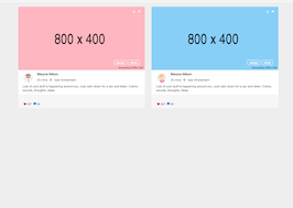
<img src="https://www.bootdey.com/image/400x400/FFB6C1/000000">
<div class="wp-block-info-over left">
<h2>
<span class="pull-left">
<a href="#">My favorite sport</a>
<span class="label label-primary">Lorem ipsum</span>
</span>
</h2>
</div>
</div>
<h2 class="title">Lovely template design</h2>
<p>
Donec id elit non mi porta gravida at eget metus. Fusce dapibus, tellus ac cursus commodo.
</p>
</div>
</div>
<div class="col-md-4 col-sm-4 col-xs-12">
<!-- Block Default - More info over block -->
<div class="wp-block inverse no-margin">
<div class="figure">
<img src="https://www.bootdey.com/image/400x400/87CEFA/000000">
<div class="wp-block-info-over left">
<h2>
<span class="pull-left">
<a href="#">This is a block label</a>
<span class="label label-primary">Lorem ipsum</span>
</span>
</h2>
</div>
</div>
<h2 class="title">Lovely template design</h2>
<p>
Donec id elit non mi porta gravida at eget metus. Fusce dapibus, tellus ac cursus commodo.
</p>
</div>
</div>
<div class="col-md-4 col-sm-4 col-xs-12">
<!-- Block Default - More info over block -->
<div class="wp-block inverse no-margin">
<div class="figure">
<img src="https://www.bootdey.com/image/400x400/FF7F50/000000">
<div class="wp-block-info-over left">
<h2>
<span class="pull-left">
<a href="#">Creating my new app</a>
<span class="label label-primary">Lorem ipsum</span>
</span>
</h2>
</div>
</div>
<h2 class="title">Lovely template design</h2>
<p>
Donec id elit non mi porta gravida at eget metus. Fusce dapibus, tellus ac cursus commodo.
</p>
</div>
</div>
</div>
</div>CSS code
This is the css code used to create this bootstrap snippet, You can copy and paste the following css code inside a page with bootstrap 3.3.4 included, to get the result that you can see in the preview selection
Download.wp-block {
margin: 0 0 15px 0;
-webkit-transition: all .3s linear;
transition: all .3s linear;
position: relative;
cursor: default;
border-radius: 2px;
}
a:hover{
text-decoration:none;
}
.no-margin {
margin: 0 !important;
}
.wp-block.inverse .figure {
position: relative;
}
.wp-block.inverse .figure img {
width: 100%;
}
.wp-block-info-over.left {
background: transparent;
border: 0;
padding: 0;
position: absolute;
bottom: 55px;
left: 0;
}
.wp-block-info-over {
width: 100%;
padding: 10px;
background: #9cd70e;
border-top: 1px solid #e0eded;
}
.wp-block-info-over.left h2 {
font-size: 13px;
font-weight: normal;
}
.wp-block.inverse h2, .wp-block.inverse .title {
margin: 0;
padding: 12px 15px 0 0;
font-weight: 500;
font-size: 16px;
color: #333;
text-transform: none;
}
.wp-block-info-over.left h2 a {
padding: 10px 15px 20px 15px;
margin: 0;
font-size: 16px;
text-transform: capitalize;
font-weight: 600;
background: rgba(51,51,51,0.8);
background: #2c3e50;
color: #fff;
border-top-right-radius: 3px;
border-bottom-right-radius: 3px;
}
.wp-block-info-over.left h2 .label {
position: absolute;
bottom: -30px;
left: 15px;
padding: .5em .6em .5em;
}
.wp-block.inverse h2, .wp-block.inverse .title {
margin: 0;
padding: 12px 15px 0 0;
font-weight: 500;
font-size: 16px;
color: #333;
text-transform: none;
}
.label {
border-radius: 0;
}
About this bootstrap example/template
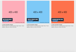
This example/template, image with label, was published on May 17th 2015, 00:20 by Bootdey Admin and it is free.
We hope you will enjoy this awesome snippet and stay tuned for the latest updates, bootdey snippets are already used in thousands of blogs, websites and projects. We believe it will save your precious time and gives trendy look to your next web project.
We always try to offer the best beautiful and responsive source of Bootstrap code examples and components.
This code example currectly have 12.3K views, Using this bootstrap snippet you have the following benefits:
Bootstrap 3.3.4
<link rel='stylesheet' href='https://netdna.bootstrapcdn.com/bootstrap/3.3.4/css/bootstrap.min.css'>
<script src='https://netdna.bootstrapcdn.com/bootstrap/3.3.4/js/bootstrap.min.js'></script>
This code example is based on bootstrap 3.3.4 and the grid system of this framework
Responsive
Based on bootstrap framework makes all the layouts perfectly responsive for all devices
Crossbrowser compatibility
Tested on all major browsers, it works smoothly on all of them
semantic html 5
Built on html / css3 the code quality is really amazing
Simple Integration
This code example can be simply integrated on existing sites and new ones too, all you need to do is copy the code and start working
