HTML code
This is the html code used to create this bootstrap snippet, You can copy and paste the following html code inside a page with bootstrap 3.3.6 included, to get the result that you can see in the preview selection
Download<section id="testmonials" class="container inner-section color01 bootstrap snippets bootdeys">
<div class="container-fluid nopadding">
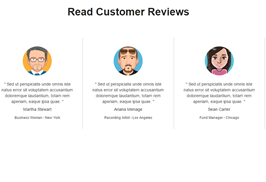
<h3 class="font-accident-two-normal uppercase text-center">Testmonials</h3>
<h5 class="font-accident-one-bold uppercase hovercolor text-center">Working hard and making the success</h5>
<div class="dividewhite1"></div>
<p class="small fontcolor-medium text-center">
Customize your website as you want using different colors and 100% free fonts. Build it from pieces and
blocks as simple as Lego. <br>
Electronic Website Template is fully responsive, looks and works perfect on any device.
</p>
<div class="dividewhite4"></div>
<div class="row">
<div class="col-md-4">
<div class="row">
<div class="col-xs-3">
<img src="https://bootdey.com/img/Content/avatar/avatar1.png" alt="Rachel James Johnes" class="img-responsive img-circle author-userpic">
</div>
<div class="col-xs-9">
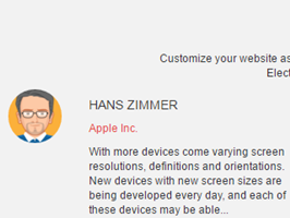
<h5 class="font-accident-one-bold text-left uppercase">Hans Zimmer</h5>
<p class="small hovercolor">Apple Inc.</p>
<p class="text-left small">
With more devices come varying screen resolutions, definitions and orientations. New devices
with new screen sizes are being developed every day, and each of these devices may be able...
</p>
</div>
</div>
<div class="divider-dynamic"></div>
</div>
<div class="col-md-4">
<div class="row">
<div class="col-xs-3">
<img src="https://bootdey.com/img/Content/avatar/avatar2.png" alt="Rachel James Johnes" class="img-responsive img-circle author-userpic">
</div>
<div class="col-xs-9">
<h5 class="font-accident-one-bold text-left uppercase">Mario Quinn</h5>
<p class="small hovercolor">Adobe</p>
<p class="text-left small">
With more devices come varying screen resolutions, definitions and orientations. New devices
with new screen sizes are being developed every day, and each of these devices
</p>
</div>
</div>
<div class="divider-dynamic"></div>
</div>
<div class="col-md-4">
<div class="row">
<div class="col-xs-3">
<img src="https://bootdey.com/img/Content/avatar/avatar3.png" alt="Rachel James Johnes" class="img-responsive img-circle author-userpic">
</div>
<div class="col-xs-9">
<h5 class="font-accident-one-bold text-left uppercase">Karl Romm</h5>
<p class="small hovercolor">BMW</p>
<p class="text-left small">
With more devices come varying screen resolutions, definitions and orientations. New devices
with new screen sizes are being developed every day, and each of these devices
</p>
</div>
</div>
<div class="divider-dynamic"></div>
</div>
</div>
<div class="dividewhite6"></div>
</div>
</section>CSS code
This is the css code used to create this bootstrap snippet, You can copy and paste the following css code inside a page with bootstrap 3.3.6 included, to get the result that you can see in the preview selection
Downloadbody{
margin-top:20px;
}
.inner-content .inner-section {
padding: 30px 50px;
}
.color01 {
background-color: #f2f2f2 !important;
}
.uppercase {
text-transform: uppercase;
}
.font-accident-two-normal {
font-family: "Dosis", sans-serif;
font-weight: 400;
}
.hovercolor, .hovercolor a {
color: #e74c3c !important;
}
About this bootstrap example/template
This example/template, grey testimonials, was published on Feb 27th 2016, 12:16 by Bootdey Admin and it is free.
We hope you will enjoy this awesome snippet and stay tuned for the latest updates, bootdey snippets are already used in thousands of blogs, websites and projects. We believe it will save your precious time and gives trendy look to your next web project.
We always try to offer the best beautiful and responsive source of Bootstrap code examples and components.
This code example currectly have 7.3K views, Using this bootstrap snippet you have the following benefits:
Bootstrap 3.3.6
<link rel='stylesheet' href='https://netdna.bootstrapcdn.com/bootstrap/3.3.6/css/bootstrap.min.css'>
<script src='https://netdna.bootstrapcdn.com/bootstrap/3.3.6/js/bootstrap.min.js'></script>
This code example is based on bootstrap 3.3.6 and the grid system of this framework
Responsive
Based on bootstrap framework makes all the layouts perfectly responsive for all devices
Crossbrowser compatibility
Tested on all major browsers, it works smoothly on all of them
semantic html 5
Built on html / css3 the code quality is really amazing
Simple Integration
This code example can be simply integrated on existing sites and new ones too, all you need to do is copy the code and start working
