HTML code
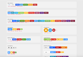
This is the html code used to create this bootstrap snippet, You can copy and paste the following html code inside a page with bootstrap 3.1.0 included, to get the result that you can see in the preview selection
Download
<div class="col-md-6 col-sm-6">
        <div class="panel panel-default">
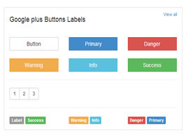
           <div class="panel-heading"><a class="pull-right" href="#">View all</a> <h4>Google plus Buttons  Labels</h4></div>
   			<div class="panel-body">
              <div class="row">
                <div class="col-xs-4"><a href="#" class="btn btn-default center-block">Button</a></div>
                <div class="col-xs-4"><a href="#" class="btn btn-primary center-block">Primary</a></div>
                <div class="col-xs-4"><a href="#" class="btn btn-danger center-block">Danger</a></div>
              </div>
              <br>
              <div class="row">
                <div class="col-xs-4"><a href="#" class="btn btn-warning center-block">Warning</a></div>
                <div class="col-xs-4"><a href="#" class="btn btn-info center-block">Info</a></div>
                <div class="col-xs-4"><a href="#" class="btn btn-success center-block">Success</a></div>
              </div>
              <hr>
              <div class="btn-group btn-group-sm"><button class="btn btn-default">1</button><button class="btn btn-default">2</button><button class="btn btn-default">3</button></div>
              <hr>
              <div class="row">
              <div class="col-md-4">
                <span class="label label-default">Label</span>
                <span class="label label-success">Success</span>

              </div>
              <div class="col-md-4">
              	<span class="label label-warning">Warning</span>
                <span class="label label-info">Info</span>
              </div>
              <div class="col-md-4">
                <span class="label label-danger">Danger</span>
                <span class="label label-primary">Primary</span>
                </div>
              </div>

            </div>
         </div>
    </div>
CSS code
This is the css code used to create this bootstrap snippet, You can copy and paste the following css code inside a page with bootstrap 3.1.0 included, to get the result that you can see in the preview selection
Download
.btn, .form-control, .panel, .list-group, .well {
    border-radius: 1px;
    box-shadow: 0 0 0;
}

.panel .panel-heading {
    background-color: #FFFFFF;
    border-color: #FFFFFF;
    color: #262626;
    font-size: 16px;
    font-weight: 700;
}

.panel .panel-heading a {
    font-size: 11px;
    font-weight: 400;
}
About this bootstrap example/template
This example/template, google plus button labels style, was published on May 10th 2014, 17:41 by Bootdey Admin and it is free.
We hope you will enjoy this awesome snippet and stay tuned for the latest updates, bootdey snippets are already used in thousands of blogs, websites and projects. We believe it will save your precious time and gives trendy look to your next web project.
We always try to offer the best beautiful and responsive source of Bootstrap code examples and components.
This code example currectly have 9.0K views, Using this bootstrap snippet you have the following benefits:
Bootstrap 3.1.0
<link rel='stylesheet' href='https://netdna.bootstrapcdn.com/bootstrap/3.1.0/css/bootstrap.min.css'>
<script src='https://netdna.bootstrapcdn.com/bootstrap/3.1.0/js/bootstrap.min.js'></script>
This code example is based on bootstrap 3.1.0 and the grid system of this framework
Responsive
Based on bootstrap framework makes all the layouts perfectly responsive for all devices
Crossbrowser compatibility
Tested on all major browsers, it works smoothly on all of them
semantic html 5
Built on html / css3 the code quality is really amazing
Simple Integration
This code example can be simply integrated on existing sites and new ones too, all you need to do is copy the code and start working
