HTML code
This is the html code used to create this bootstrap snippet, You can copy and paste the following html code inside a page with bootstrap 4.5.0 included, to get the result that you can see in the preview selection
Download<div class="container">
<div class="row justify-content-center">
<div class="col-12 text-center">
<div class="section-title mb-4 pb-2">
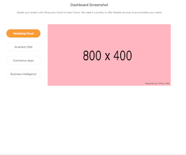
<h4 class="title mb-4">Dashboard Screenshot</h4>
<p class="text-muted mx-auto para-desc mb-0">Splash your dream color Bring your home to lively Colors. We make it a priotity to offer flexible services to accomodate your needs</p>
</div>
</div><!--end col-->
</div><!--end row-->
<div class="row mt-4 pt-2 align-items-center">
<div class="col-lg-3 col-md-4 col-12">
<ul class="nav nav-pills nav-justified" id="pills-tab" role="tablist">
<li class="nav-item mb-4 pt-2">
<a class="nav-link rounded-pill" id="pills-cloud-tab" data-toggle="pill" href="#pills-cloud" role="tab" aria-controls="pills-cloud" aria-selected="false">
<div class="screenshot text-center pt-2 pb-2">
<h4 class="title font-weight-normal mb-0">Marketing Cloud</h4>
</div>
</a><!--end nav link-->
</li><!--end nav item-->
<li class="nav-item mb-4 pt-2">
<a class="nav-link rounded-pill" id="pills-smart-tab" data-toggle="pill" href="#pills-smart" role="tab" aria-controls="pills-smart" aria-selected="false">
<div class="screenshot text-center pt-2 pb-2">
<h4 class="title font-weight-normal mb-0">Smartest CRM</h4>
</div>
</a><!--end nav link-->
</li><!--end nav item-->
<li class="nav-item mb-4 pt-2">
<a class="nav-link rounded-pill" id="pills-apps-tab" data-toggle="pill" href="#pills-apps" role="tab" aria-controls="pills-apps" aria-selected="false">
<div class="screenshot text-center pt-2 pb-2">
<h4 class="title font-weight-normal mb-0">Commerce Apps</h4>
</div>
</a><!--end nav link-->
</li><!--end nav item-->
<li class="nav-item mb-4 pt-2">
<a class="nav-link rounded-pill active" id="pills-intelligence-tab" data-toggle="pill" href="#pills-intelligence" role="tab" aria-controls="pills-intelligence" aria-selected="true">
<div class="screenshot text-center pt-2 pb-2">
<h4 class="title font-weight-normal mb-0">Business Intelligence</h4>
</div>
</a><!--end nav link-->
</li><!--end nav item-->
</ul><!--end nav pills-->
</div><!--end col-->
<div class="col-lg-9 col-md-8 col-12 mt-4 pt-2 mt-sm-0 pt-sm-0">
<div class="tab-content" id="pills-tabContent">
<div class="tab-pane fade" id="pills-cloud" role="tabpanel" aria-labelledby="pills-cloud-tab">
<img src="https://www.bootdey.com/image/800x400/FFB6C1/000000" class="img-fluid" alt="">
</div><!--end teb pane-->
<div class="tab-pane fade" id="pills-smart" role="tabpanel" aria-labelledby="pills-smart-tab">
<img src="https://www.bootdey.com/image/800x400/87CEFA/000000" class="img-fluid" alt="">
</div><!--end teb pane-->
<div class="tab-pane fade" id="pills-apps" role="tabpanel" aria-labelledby="pills-apps-tab">
<img src="https://www.bootdey.com/image/800x400/FF7F50/000000" class="img-fluid" alt="">
</div><!--end teb pane-->
<div class="tab-pane fade active show" id="pills-intelligence" role="tabpanel" aria-labelledby="pills-intelligence-tab">
<img src="https://www.bootdey.com/image/800x400/20B2AA/000000" class="img-fluid" alt="">
</div><!--end teb pane-->
</div><!--end tab content-->
</div><!--end col-->
</div><!--end row-->
</div>CSS code
This is the css code used to create this bootstrap snippet, You can copy and paste the following css code inside a page with bootstrap 4.5.0 included, to get the result that you can see in the preview selection
Downloadbody{margin-top:20px;
}
.nav-pills .nav-link {
color: #2f3c4e !important;
margin: auto 15px;
border: 1px solid #e9ecef;
}
.nav-pills .nav-link.active {
background-color: #f89d36;
color: #ffffff !important;
-webkit-box-shadow: 0 0 3px rgba(47, 60, 78, 0.15);
box-shadow: 0 0 3px rgba(47, 60, 78, 0.15);
}
.nav-pills a .screenshot .title {
font-size: 18px;
}
About this bootstrap example/template
This example/template, custom nav pills, was published on Oct 8th 2020, 08:14 by Bootdey Admin and it is free.
We hope you will enjoy this awesome snippet and stay tuned for the latest updates, bootdey snippets are already used in thousands of blogs, websites and projects. We believe it will save your precious time and gives trendy look to your next web project.
We always try to offer the best beautiful and responsive source of Bootstrap code examples and components.
This code example currectly have 4.4K views, Using this bootstrap snippet you have the following benefits:
Bootstrap 4.5.0
<link rel='stylesheet' href='https://cdn.jsdelivr.net/npm/[email protected]/dist/css/bootstrap.min.css'>
<script src='https://cdn.jsdelivr.net/npm/[email protected]/dist/js/bootstrap.bundle.min.js'></script>
This code example is based on bootstrap 4.5.0 and the grid system of this framework
Responsive
Based on bootstrap framework makes all the layouts perfectly responsive for all devices
Crossbrowser compatibility
Tested on all major browsers, it works smoothly on all of them
semantic html 5
Built on html / css3 the code quality is really amazing
Simple Integration
This code example can be simply integrated on existing sites and new ones too, all you need to do is copy the code and start working
