HTML code
This is the html code used to create this bootstrap snippet, You can copy and paste the following html code inside a page with bootstrap 5.0.1 included, to get the result that you can see in the preview selection
Download<div class="container-xl px-4 mt-4">
<!-- Account page navigation-->
<nav class="nav nav-borders">
<a class="nav-link ms-0" href="https://www.bootdey.com/snippets/view/bs5-edit-profile-account-details" target="__blank">Profile</a>
<a class="nav-link" href="https://www.bootdey.com/snippets/view/bs5-profile-billing-page" target="__blank">Billing</a>
<a class="nav-link active" href="https://www.bootdey.com/snippets/view/bs5-profile-security-page" target="__blank">Security</a>
<a class="nav-link" href="https://www.bootdey.com/snippets/view/bs5-edit-notifications-page" target="__blank">Notifications</a>
</nav>
<hr class="mt-0 mb-4">
<div class="row">
<div class="col-lg-8">
<!-- Change password card-->
<div class="card mb-4">
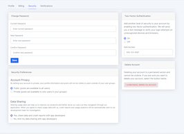
<div class="card-header">Change Password</div>
<div class="card-body">
<form>
<!-- Form Group (current password)-->
<div class="mb-3">
<label class="small mb-1" for="currentPassword">Current Password</label>
<input class="form-control" id="currentPassword" type="password" placeholder="Enter current password">
</div>
<!-- Form Group (new password)-->
<div class="mb-3">
<label class="small mb-1" for="newPassword">New Password</label>
<input class="form-control" id="newPassword" type="password" placeholder="Enter new password">
</div>
<!-- Form Group (confirm password)-->
<div class="mb-3">
<label class="small mb-1" for="confirmPassword">Confirm Password</label>
<input class="form-control" id="confirmPassword" type="password" placeholder="Confirm new password">
</div>
<button class="btn btn-primary" type="button">Save</button>
</form>
</div>
</div>
<!-- Security preferences card-->
<div class="card mb-4">
<div class="card-header">Security Preferences</div>
<div class="card-body">
<!-- Account privacy optinos-->
<h5 class="mb-1">Account Privacy</h5>
<p class="small text-muted">By setting your account to private, your profile information and posts will not be visible to users outside of your user groups.</p>
<form>
<div class="form-check">
<input class="form-check-input" id="radioPrivacy1" type="radio" name="radioPrivacy" checked="">
<label class="form-check-label" for="radioPrivacy1">Public (posts are available to all users)</label>
</div>
<div class="form-check">
<input class="form-check-input" id="radioPrivacy2" type="radio" name="radioPrivacy">
<label class="form-check-label" for="radioPrivacy2">Private (posts are available to only users in your groups)</label>
</div>
</form>
<hr class="my-4">
<!-- Data sharing options-->
<h5 class="mb-1">Data Sharing</h5>
<p class="small text-muted">Sharing usage data can help us to improve our products and better serve our users as they navigation through our application. When you agree to share usage data with us, crash reports and usage analytics will be automatically sent to our development team for investigation.</p>
<form>
<div class="form-check">
<input class="form-check-input" id="radioUsage1" type="radio" name="radioUsage" checked="">
<label class="form-check-label" for="radioUsage1">Yes, share data and crash reports with app developers</label>
</div>
<div class="form-check">
<input class="form-check-input" id="radioUsage2" type="radio" name="radioUsage">
<label class="form-check-label" for="radioUsage2">No, limit my data sharing with app developers</label>
</div>
</form>
</div>
</div>
</div>
<div class="col-lg-4">
<!-- Two factor authentication card-->
<div class="card mb-4">
<div class="card-header">Two-Factor Authentication</div>
<div class="card-body">
<p>Add another level of security to your account by enabling two-factor authentication. We will send you a text message to verify your login attempts on unrecognized devices and browsers.</p>
<form>
<div class="form-check">
<input class="form-check-input" id="twoFactorOn" type="radio" name="twoFactor" checked="">
<label class="form-check-label" for="twoFactorOn">On</label>
</div>
<div class="form-check">
<input class="form-check-input" id="twoFactorOff" type="radio" name="twoFactor">
<label class="form-check-label" for="twoFactorOff">Off</label>
</div>
<div class="mt-3">
<label class="small mb-1" for="twoFactorSMS">SMS Number</label>
<input class="form-control" id="twoFactorSMS" type="tel" placeholder="Enter a phone number" value="555-123-4567">
</div>
</form>
</div>
</div>
<!-- Delete account card-->
<div class="card mb-4">
<div class="card-header">Delete Account</div>
<div class="card-body">
<p>Deleting your account is a permanent action and cannot be undone. If you are sure you want to delete your account, select the button below.</p>
<button class="btn btn-danger-soft text-danger" type="button">I understand, delete my account</button>
</div>
</div>
</div>
</div>
</div>CSS code
This is the css code used to create this bootstrap snippet, You can copy and paste the following css code inside a page with bootstrap 5.0.1 included, to get the result that you can see in the preview selection
Downloadbody{margin-top:20px;
background-color:#f2f6fc;
color:#69707a;
}
.img-account-profile {
height: 10rem;
}
.rounded-circle {
border-radius: 50% !important;
}
.card {
box-shadow: 0 0.15rem 1.75rem 0 rgb(33 40 50 / 15%);
}
.card .card-header {
font-weight: 500;
}
.card-header:first-child {
border-radius: 0.35rem 0.35rem 0 0;
}
.card-header {
padding: 1rem 1.35rem;
margin-bottom: 0;
background-color: rgba(33, 40, 50, 0.03);
border-bottom: 1px solid rgba(33, 40, 50, 0.125);
}
.form-control, .dataTable-input {
display: block;
width: 100%;
padding: 0.875rem 1.125rem;
font-size: 0.875rem;
font-weight: 400;
line-height: 1;
color: #69707a;
background-color: #fff;
background-clip: padding-box;
border: 1px solid #c5ccd6;
-webkit-appearance: none;
-moz-appearance: none;
appearance: none;
border-radius: 0.35rem;
transition: border-color 0.15s ease-in-out, box-shadow 0.15s ease-in-out;
}
.nav-borders .nav-link.active {
color: #0061f2;
border-bottom-color: #0061f2;
}
.nav-borders .nav-link {
color: #69707a;
border-bottom-width: 0.125rem;
border-bottom-style: solid;
border-bottom-color: transparent;
padding-top: 0.5rem;
padding-bottom: 0.5rem;
padding-left: 0;
padding-right: 0;
margin-left: 1rem;
margin-right: 1rem;
}
.btn-danger-soft {
color: #000;
background-color: #f1e0e3;
border-color: #f1e0e3;
}
About this bootstrap example/template
This example/template, bs5 profile security page, was published on Sep 20th 2021, 10:33 by Bootdey Admin and it is free.
We hope you will enjoy this awesome snippet and stay tuned for the latest updates, bootdey snippets are already used in thousands of blogs, websites and projects. We believe it will save your precious time and gives trendy look to your next web project.
We always try to offer the best beautiful and responsive source of Bootstrap code examples and components.
This code example currectly have 40.4K views, Using this bootstrap snippet you have the following benefits:
Bootstrap 5.0.1
<link rel='stylesheet' href='https://cdn.jsdelivr.net/npm/[email protected]/dist/css/bootstrap.min.css'>
<script src='https://cdn.jsdelivr.net/npm/[email protected]/dist/js/bootstrap.bundle.min.js'></script>
This code example is based on bootstrap 5.0.1 and the grid system of this framework
Responsive
Based on bootstrap framework makes all the layouts perfectly responsive for all devices
Crossbrowser compatibility
Tested on all major browsers, it works smoothly on all of them
semantic html 5
Built on html / css3 the code quality is really amazing
Simple Integration
This code example can be simply integrated on existing sites and new ones too, all you need to do is copy the code and start working
