HTML code
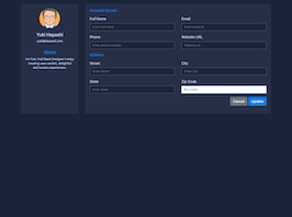
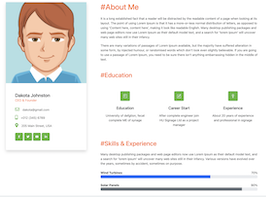
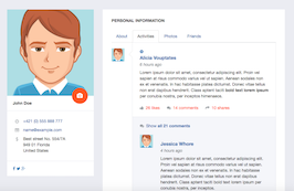
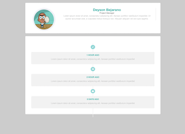
This is the html code used to create this bootstrap snippet, You can copy and paste the following html code inside a page with bootstrap 4.1.1 included, to get the result that you can see in the preview selection
Download<div class="bg-container">
<div class="container">
<div class="text-center py-5">
<img src="https://bootdey.com/img/Content/avatar/avatar7.png" alt class="ui-w-100 rounded-circle">
<div class="col-md-8 col-lg-6 col-xl-5 p-0 mx-auto">
<h4 class="font-weight-bold my-4 text-white">John Doe</h4>
<div class="text-muted mb-4">
Lorem ipsum dolor sit amet, nibh suavitate qualisque ut nam. Ad harum primis electram duo, porro principes ei has.
</div>
</div>
<div class="text-center">
<a href="#" class="d-inline-block text-dark">
<strong class="text-white">234</strong>
<span class="text-muted">followers</span>
</a>
<a href="#" class="d-inline-block text-dark ml-3">
<strong class="text-white">111</strong>
<span class="text-muted">following</span>
</a>
</div>
</div>
</div>
<hr class="m-0">
<ul class="nav nav-tabs bg-tabs-content tabs-alt justify-content-center">
<li class="nav-item">
<a class="nav-link py-4 active" href="#">Posts</a>
</li>
<li class="nav-item">
<a class="nav-link py-4" href="#">Likes</a>
</li>
<li class="nav-item">
<a class="nav-link py-4" href="#">Followers</a>
</li>
<li class="nav-item">
<a class="nav-link py-4" href="#">Following</a>
</li>
</ul>
</div>CSS code
This is the css code used to create this bootstrap snippet, You can copy and paste the following css code inside a page with bootstrap 4.1.1 included, to get the result that you can see in the preview selection
Download.bg-container{
background:#40E0D0;
}
.bg-tabs-content{
background:#20B2AA;
}
.text-white {
color: #fff !important;
}
.ui-bg-overlay-container, .ui-bg-video-container {
position: relative;
}
.ui-bg-cover {
background-color: transparent;
background-position: center center;
background-size: cover;
}
.ui-bg-overlay-container .ui-bg-overlay {
position: absolute;
top: 0;
right: 0;
bottom: 0;
left: 0;
display: block;
}
.bg-dark {
background-color: rgba(24,28,33,0.9) !important;
}
.opacity-50 {
opacity: .5 !important;
}
.bg-dark {
background-color: rgba(24,28,33,0.9) !important;
}
.ui-bg-overlay-container>*, .ui-bg-video-container>* {
position: relative;
}
@media (min-width: 992px){
.container, .container-fluid {
padding-right: 2rem;
padding-left: 2rem;
}
}
.media, .media>:not(.media-body), .jumbotron, .card {
-ms-flex-negative: 1;
flex-shrink: 1;
}
.d-flex, .d-inline-flex, .media, .media>:not(.media-body), .jumbotron, .card {
-ms-flex-negative: 1;
flex-shrink: 1;
}
.ui-w-100 {
width: 100px !important;
height: auto;
}
.font-weight-bold {
font-weight: 700 !important;
}
.opacity-75 {
opacity: .75 !important;
}
.tabs-alt.nav-tabs .nav-link.active, .tabs-alt.nav-tabs .nav-link.active:hover, .tabs-alt.nav-tabs .nav-link.active:focus, .tabs-alt>.nav-tabs .nav-link.active, .tabs-alt>.nav-tabs .nav-link.active:hover, .tabs-alt>.nav-tabs .nav-link.active:focus {
-webkit-box-shadow: 0 -2px 0 #26B4FF inset;
box-shadow: 0 -2px 0 #26B4FF inset;
}
.nav-tabs:not(.nav-fill):not(.nav-justified) .nav-link, .nav-pills:not(.nav-fill):not(.nav-justified) .nav-link {
margin-right: .125rem;
}
.nav-tabs.tabs-alt .nav-link, .tabs-alt>.nav-tabs .nav-link {
border-width: 0 !important;
border-radius: 0 !important;
background-color: transparent !important;
}
.nav-tabs .nav-link.active {
border-bottom-color: #fff;
}
About this bootstrap example/template
This example/template, bs4 vertical profile header, was published on Sep 13th 2018, 21:54 by Bootdey Admin and it is free.
We hope you will enjoy this awesome snippet and stay tuned for the latest updates, bootdey snippets are already used in thousands of blogs, websites and projects. We believe it will save your precious time and gives trendy look to your next web project.
We always try to offer the best beautiful and responsive source of Bootstrap code examples and components.
This code example currectly have 7.1K views, Using this bootstrap snippet you have the following benefits:
Bootstrap 4.1.1
<link rel='stylesheet' href='https://cdn.jsdelivr.net/npm/[email protected]/dist/css/bootstrap.min.css'>
<script src='https://cdn.jsdelivr.net/npm/[email protected]/dist/js/bootstrap.bundle.min.js'></script>
This code example is based on bootstrap 4.1.1 and the grid system of this framework
Responsive
Based on bootstrap framework makes all the layouts perfectly responsive for all devices
Crossbrowser compatibility
Tested on all major browsers, it works smoothly on all of them
semantic html 5
Built on html / css3 the code quality is really amazing
Simple Integration
This code example can be simply integrated on existing sites and new ones too, all you need to do is copy the code and start working
