HTML code
This is the html code used to create this bootstrap snippet, You can copy and paste the following html code inside a page with bootstrap 4.4.1 included, to get the result that you can see in the preview selection
Download<link href="https://maxcdn.bootstrapcdn.com/font-awesome/4.7.0/css/font-awesome.min.css" rel="stylesheet">
<div class="container">
<div class="card">
<div class="card-body">
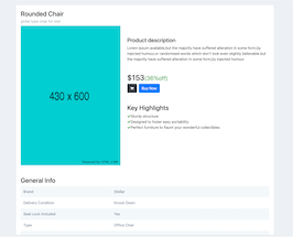
<h3 class="card-title">Rounded Chair</h3>
<h6 class="card-subtitle">globe type chair for rest</h6>
<div class="row">
<div class="col-lg-5 col-md-5 col-sm-6">
<div class="white-box text-center"><img src="https://www.bootdey.com/image/430x600/00CED1/000000" class="img-responsive"></div>
</div>
<div class="col-lg-7 col-md-7 col-sm-6">
<h4 class="box-title mt-5">Product description</h4>
<p>Lorem Ipsum available,but the majority have suffered alteration in some form,by injected humour,or randomised words which don't look even slightly believable.but the majority have suffered alteration in some form,by injected humour</p>
<h2 class="mt-5">
$153<small class="text-success">(36%off)</small>
</h2>
<button class="btn btn-dark btn-rounded mr-1" data-toggle="tooltip" title="" data-original-title="Add to cart">
<i class="fa fa-shopping-cart"></i>
</button>
<button class="btn btn-primary btn-rounded">Buy Now</button>
<h3 class="box-title mt-5">Key Highlights</h3>
<ul class="list-unstyled">
<li><i class="fa fa-check text-success"></i>Sturdy structure</li>
<li><i class="fa fa-check text-success"></i>Designed to foster easy portability</li>
<li><i class="fa fa-check text-success"></i>Perfect furniture to flaunt your wonderful collectibles</li>
</ul>
</div>
<div class="col-lg-12 col-md-12 col-sm-12">
<h3 class="box-title mt-5">General Info</h3>
<div class="table-responsive">
<table class="table table-striped table-product">
<tbody>
<tr>
<td width="390">Brand</td>
<td>Stellar</td>
</tr>
<tr>
<td>Delivery Condition</td>
<td>Knock Down</td>
</tr>
<tr>
<td>Seat Lock Included</td>
<td>Yes</td>
</tr>
<tr>
<td>Type</td>
<td>Office Chair</td>
</tr>
<tr>
<td>Style</td>
<td>Contemporary&Modern</td>
</tr>
<tr>
<td>Wheels Included</td>
<td>Yes</td>
</tr>
<tr>
<td>Upholstery Included</td>
<td>Yes</td>
</tr>
<tr>
<td>Upholstery Type</td>
<td>Cushion</td>
</tr>
<tr>
<td>Head Support</td>
<td>No</td>
</tr>
<tr>
<td>Suitable For</td>
<td>Study&Home Office</td>
</tr>
<tr>
<td>Adjustable Height</td>
<td>Yes</td>
</tr>
<tr>
<td>Model Number</td>
<td>F01020701-00HT744A06</td>
</tr>
<tr>
<td>Armrest Included</td>
<td>Yes</td>
</tr>
<tr>
<td>Care Instructions</td>
<td>Handle With Care,Keep In Dry Place,Do Not Apply Any Chemical For Cleaning.</td>
</tr>
<tr>
<td>Finish Type</td>
<td>Matte</td>
</tr>
</tbody>
</table>
</div>
</div>
</div>
</div>
</div>
</div>CSS code
This is the css code used to create this bootstrap snippet, You can copy and paste the following css code inside a page with bootstrap 4.4.1 included, to get the result that you can see in the preview selection
Downloadbody{
background-color: #edf1f5;
margin-top:20px;
}
.card {
margin-bottom: 30px;
}
.card {
position: relative;
display: flex;
flex-direction: column;
min-width: 0;
word-wrap: break-word;
background-color: #fff;
background-clip: border-box;
border: 0 solid transparent;
border-radius: 0;
}
.card .card-subtitle {
font-weight: 300;
margin-bottom: 10px;
color: #8898aa;
}
.table-product.table-striped tbody tr:nth-of-type(odd) {
background-color: #f3f8fa!important
}
.table-product td{
border-top: 0px solid #dee2e6 !important;
color: #728299!important;
}
About this bootstrap example/template
This example/template, bs4 product detail, was published on Jun 14th 2020, 12:20 by Bootdey Admin and it is free.
We hope you will enjoy this awesome snippet and stay tuned for the latest updates, bootdey snippets are already used in thousands of blogs, websites and projects. We believe it will save your precious time and gives trendy look to your next web project.
We always try to offer the best beautiful and responsive source of Bootstrap code examples and components.
This code example currectly have 20.6K views, Using this bootstrap snippet you have the following benefits:
Bootstrap 4.4.1
<link rel='stylesheet' href='https://cdn.jsdelivr.net/npm/[email protected]/dist/css/bootstrap.min.css'>
<script src='https://cdn.jsdelivr.net/npm/[email protected]/dist/js/bootstrap.bundle.min.js'></script>
This code example is based on bootstrap 4.4.1 and the grid system of this framework
Responsive
Based on bootstrap framework makes all the layouts perfectly responsive for all devices
Crossbrowser compatibility
Tested on all major browsers, it works smoothly on all of them
semantic html 5
Built on html / css3 the code quality is really amazing
Simple Integration
This code example can be simply integrated on existing sites and new ones too, all you need to do is copy the code and start working
