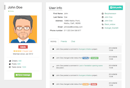
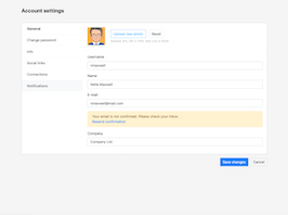
HTML code
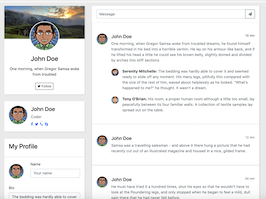
This is the html code used to create this bootstrap snippet, You can copy and paste the following html code inside a page with bootstrap 4.1.1 included, to get the result that you can see in the preview selection
Download<link href="https://maxcdn.bootstrapcdn.com/font-awesome/4.3.0/css/font-awesome.min.css" rel="stylesheet">
<div class="container">
<div class="row">
<div class="col-lg-4">
<div class="card card-profile">
<div style="background-image: url(https://demo.bootstrapious.com/admin-premium/1-4-5/img/photos/paul-morris-116514-unsplash.jpg);" class="card-header"></div>
<div class="card-body text-center"><img src="https://bootdey.com/img/Content/avatar/avatar2.png" class="card-profile-img">
<h3 class="mb-3">John Doe</h3>
<p class="mb-4">One morning, when Gregor Samsa woke from troubled </p>
<button class="btn btn-outline-dark btn-sm"><span class="fa fa-twitter"></span> Follow</button>
</div>
</div>
<div class="card">
<div class="card-body">
<div class="media"><span style="background-image: url(https://bootdey.com/img/Content/avatar/avatar2.png)" class="avatar avatar-xl mr-3"></span>
<div class="media-body">
<h4>John Doe</h4>
<p class="text-muted mb-0">Coder</p>
<ul class="social-links list-inline mb-0 mt-2">
<li class="list-inline-item"><a href="javascript:void(0)" data-toggle="tooltip" data-placement="top" title="" data-original-title="Nathan's Facebook"><i class="fa fa-facebook"></i></a></li>
<li class="list-inline-item"><a href="javascript:void(0)" data-toggle="tooltip" data-placement="top" title="" data-original-title="@nathan_andrews"><i class="fa fa-twitter"></i></a></li>
<li class="list-inline-item"><a href="javascript:void(0)" data-toggle="tooltip" data-placement="top" title="" data-original-title="+420777555987"><i class="fa fa-phone"></i></a></li>
<li class="list-inline-item"><a href="javascript:void(0)" data-toggle="tooltip" data-placement="top" title="" data-original-title="@nathan"><i class="fa fa-skype"></i></a></li>
</ul>
</div>
</div>
</div>
</div>
<form class="card">
<div class="card-header">
<h3 class="card-title">My Profile</h3>
</div>
<div class="card-body">
<div class="row mb-3">
<div class="col-auto d-flex align-items-center"><span style="background-image: url(https://bootdey.com/img/Content/avatar/avatar2.png)" class="avatar avatar-lg"></span></div>
<div class="col">
<div class="form-group">
<label class="form-label">Name</label>
<input placeholder="Your name" class="form-control">
</div>
</div>
</div>
<div class="form-group">
<label class="form-label">Bio</label>
<textarea rows="8" class="form-control">The bedding was hardly able to cover it and seemed ready to slide off any moment. His many legs, pitifully thin compared with the size of the rest of him, waved about helplessly as he looked. "What's happened to me?" he thought. It wasn't a dream.</textarea>
</div>
<div class="form-group">
<label class="form-label">Email</label>
<input placeholder="[email protected]" class="form-control">
</div>
<div class="form-group">
<label class="form-label">Password</label>
<input type="password" value="password" class="form-control">
</div>
</div>
<div class="card-footer text-right">
<button class="btn btn-primary">Save</button>
</div>
</form>
</div>
<div class="col-lg-8">
<div class="card">
<div class="card-header">
<div class="input-group">
<input type="text" placeholder="Message" class="form-control">
<div class="input-group-append">
<button type="button" class="btn btn-outline-secondary"><i class="fa fa-send"></i></button>
</div>
</div>
</div>
<div class="list-group card-list-group">
<div class="list-group-item py-5">
<div class="media">
<div style="background-image: url(https://bootdey.com/img/Content/avatar/avatar2.png)" class="media-object avatar avatar-md mr-3"></div>
<div class="media-body">
<div class="media-heading"><small class="float-right">10 min</small>
<h5>John Doe</h5>
</div>
<div class="text-muted text-small">One morning, when Gregor Samsa woke from troubled dreams, he found himself transformed in his bed into a horrible vermin. He lay on his armour-like back, and if he lifted his head a little he could see his brown belly, slightly domed and divided by arches into stiff sections</div>
<div class="media-list">
<div class="media mt-4">
<div style="background-image: url(https://bootdey.com/img/Content/avatar/avatar3.png)" class="media-object avatar mr-3"></div>
<div class="media-body text-muted text-small"><strong class="text-dark">Serenity Mitchelle: </strong>The bedding was hardly able to cover it and seemed ready to slide off any moment. His many legs, pitifully thin compared with the size of the rest of him, waved about helplessly as he looked. "What's happened to me?" he thought. It wasn't a dream.</div>
</div>
<div class="media mt-4">
<div style="background-image: url(https://bootdey.com/img/Content/avatar/avatar4.png)" class="media-object avatar mr-3"></div>
<div class="media-body text-muted text-small"><strong class="text-dark">Tony O'Brian: </strong>His room, a proper human room although a little too small, lay peacefully between its four familiar walls. A collection of textile samples lay spread out on the table.</div>
</div>
</div>
</div>
</div>
</div>
<div class="list-group-item py-5">
<div class="media">
<div style="background-image: url(https://bootdey.com/img/Content/avatar/avatar2.png)" class="media-object avatar avatar-md mr-3"></div>
<div class="media-body">
<div class="media-heading"><small class="float-right text-muted">12 min</small>
<h5>John Doe</h5>
</div>
<div class="text-muted text-small">Samsa was a travelling salesman - and above it there hung a picture that he had recently cut out of an illustrated magazine and housed in a nice, gilded frame.</div>
</div>
</div>
</div>
<div class="list-group-item py-5">
<div class="media">
<div style="background-image: url(https://bootdey.com/img/Content/avatar/avatar2.png)" class="media-object avatar avatar-md mr-3"></div>
<div class="media-body">
<div class="media-heading"><small class="float-right text-muted">34 min</small>
<h5>John Doe</h5>
</div>
<div class="text-muted text-small">He must have tried it a hundred times, shut his eyes so that he wouldn't have to look at the floundering legs, and only stopped when he began to feel a mild, dull pain there that he had never felt before.</div>
<div class="media-list">
<div class="media mt-4">
<div style="background-image: url(https://bootdey.com/img/Content/avatar/avatar3.png)" class="media-object avatar mr-3"></div>
<div class="media-body text-muted text-small"><strong class="text-dark">Javier Gregory: </strong>One morning, when Gregor Samsa woke from troubled dreams, he found himself transformed in his bed into a horrible vermin. He lay on his armour-like back, and if he lifted his head a little he could see his brown belly, slightly domed and divided by arches into stiff sections</div>
</div>
</div>
</div>
</div>
</div>
</div>
</div>
<form class="card">
<div class="card-body">
<h3 class="card-title">Edit Profile</h3>
<div class="row">
<div class="col-md-5">
<div class="form-group mb-4">
<label class="form-label">Company</label>
<input type="text" placeholder="Company" value="Nathan & Nathan" class="form-control">
</div>
</div>
<div class="col-sm-6 col-md-3">
<div class="form-group mb-4">
<label class="form-label">Username</label>
<input type="text" placeholder="Username" value="nathan" class="form-control">
</div>
</div>
<div class="col-sm-6 col-md-4">
<div class="form-group mb-4">
<label class="form-label">Email address</label>
<input type="email" placeholder="Email" class="form-control">
</div>
</div>
<div class="col-sm-6 col-md-6">
<div class="form-group mb-4">
<label class="form-label">First Name</label>
<input type="text" placeholder="First name" class="form-control">
</div>
</div>
<div class="col-sm-6 col-md-6">
<div class="form-group mb-4">
<label class="form-label">Last Name</label>
<input type="text" placeholder="Last Name" class="form-control">
</div>
</div>
<div class="col-md-12">
<div class="form-group mb-4">
<label class="form-label">Address</label>
<input type="text" placeholder="Home Address" class="form-control">
</div>
</div>
<div class="col-sm-6 col-md-4">
<div class="form-group mb-4">
<label class="form-label">City</label>
<input type="text" placeholder="City" class="form-control">
</div>
</div>
<div class="col-sm-6 col-md-3">
<div class="form-group mb-4">
<label class="form-label">ZIP</label>
<input type="number" placeholder="ZIP" class="form-control">
</div>
</div>
<div class="col-md-5">
<div class="form-group mb-4">
<label class="form-label">Country</label>
<select class="form-control custom-select">
<option value="">UK</option>
<option value="">US</option>
</select>
</div>
</div>
<div class="col-md-12">
<div class="form-group mb-0">
<label class="form-label">About Me</label>
<textarea rows="5" placeholder="Here can be your description" value="Mike" class="form-control">The bedding was hardly able to cover it and seemed ready to slide off any moment. His many legs, pitifully thin compared with the size of the rest of him, waved about helplessly as he looked. "What's happened to me?" he thought. It wasn't a dream.</textarea>
</div>
</div>
</div>
</div>
<div class="card-footer text-right">
<button type="submit" class="btn btn-primary">Update Profile</button>
</div>
</form>
</div>
</div>
</div>CSS code
This is the css code used to create this bootstrap snippet, You can copy and paste the following css code inside a page with bootstrap 4.1.1 included, to get the result that you can see in the preview selection
Downloadbody{
margin-top:20px;
background:#eee;
}
.card {
background-color: #fff;
border: 0 solid #eee;
border-radius: 0;
}
.card {
margin-bottom: 30px;
-webkit-box-shadow: 2px 2px 2px rgba(0,0,0,0.1), -1px 0 2px rgba(0,0,0,0.05);
box-shadow: 2px 2px 2px rgba(0,0,0,0.1), -1px 0 2px rgba(0,0,0,0.05);
}
.card-profile .card-header {
height: 9rem;
background-size: cover;
background-position: center center
}
.card-profile-img {
max-width: 8rem;
margin-top: -6rem;
margin-bottom: 1rem;
border: 3px solid #fff;
border-radius: 100%
}
.avatar {
width: 2rem;
height: 2rem;
line-height: 2rem;
border-radius: 50%;
display: inline-block;
background: #ced4da no-repeat center/cover;
position: relative;
text-align: center;
color: #868e96;
font-weight: 600;
vertical-align: bottom
}
.avatar.avatar-md {
width: 3rem;
height: 3rem
}
.avatar.avatar-lg {
width: 4rem;
height: 4rem
}
.avatar.avatar-xl {
width: 5rem;
height: 5rem
}
.avatar.avatar-xxl {
width: 7rem;
height: 7rem;
min-width: 7rem
}
.card-header:first-child {
border-radius: 0 0 0 0;
}
.card-header:first-child {
border-radius: calc(.25rem - 1px) calc(.25rem - 1px) 0 0;
}
.card-header {
padding: 1rem 1.25rem;
background-color: #fff;
border-bottom: 1px solid #eee;
}
.card-header {
-webkit-box-shadow: 2px 2px 2px rgba(0,0,0,0.05);
box-shadow: 2px 2px 2px rgba(0,0,0,0.05);
}
About this bootstrap example/template
This example/template, bs4 Home Profile, was published on Mar 9th 2019, 08:02 by Bootdey Admin and it is free.
We hope you will enjoy this awesome snippet and stay tuned for the latest updates, bootdey snippets are already used in thousands of blogs, websites and projects. We believe it will save your precious time and gives trendy look to your next web project.
We always try to offer the best beautiful and responsive source of Bootstrap code examples and components.
This code example currectly have 10.0K views, Using this bootstrap snippet you have the following benefits:
Bootstrap 4.1.1
<link rel='stylesheet' href='https://cdn.jsdelivr.net/npm/[email protected]/dist/css/bootstrap.min.css'>
<script src='https://cdn.jsdelivr.net/npm/[email protected]/dist/js/bootstrap.bundle.min.js'></script>
This code example is based on bootstrap 4.1.1 and the grid system of this framework
Responsive
Based on bootstrap framework makes all the layouts perfectly responsive for all devices
Crossbrowser compatibility
Tested on all major browsers, it works smoothly on all of them
semantic html 5
Built on html / css3 the code quality is really amazing
Simple Integration
This code example can be simply integrated on existing sites and new ones too, all you need to do is copy the code and start working
