HTML code
This is the html code used to create this bootstrap snippet, You can copy and paste the following html code inside a page with bootstrap 4.5.0 included, to get the result that you can see in the preview selection
Download<section class="section about-section gray-bg" id="about">
<div class="container">
<div class="row align-items-center justify-content-around flex-row-reverse">
<div class="col-lg-6">
<div class="about-text">
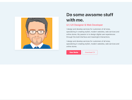
<h3 class="dark-color">Do some awsome stuff with me.</h3>
<h4 class="theme-color">UI / UX Designer & Web Developer</h4>
<p>I design and develop services for customers of all sizes, specializing in creating stylish, modern websites, web services and online stores. My passion is to design digital user experiences through the bold interface and meaningful interactions.</p>
<p>I design and develop services for customers of all sizes, specializing in creating stylish, modern websites, web services and online stores.</p>
<div class="btn-bar">
<a class="px-btn theme" href="#">View Works</a>
<a class="px-btn theme-t" href="#">Download CV</a>
</div>
</div>
</div>
<div class="col-lg-5 text-center">
<div class="about-img">
<img src="https://bootdey.com/img/Content/avatar/avatar1.png">
</div>
</div>
</div>
</div>
</section>CSS code
This is the css code used to create this bootstrap snippet, You can copy and paste the following css code inside a page with bootstrap 4.5.0 included, to get the result that you can see in the preview selection
Downloadbody{margin-top:20px;}
/* About Me
---------------------*/
@media (max-width: 991px) {
.about-text {
margin-top: 40px;
}
}
.about-text h3 {
font-size: 45px;
font-weight: 700;
margin: 0 0 10px;
}
@media (max-width: 767px) {
.about-text h3 {
font-size: 35px;
}
}
.about-text h4 {
font-weight: 600;
margin-bottom: 15px;
}
@media (max-width: 767px) {
.about-text h4 {
font-size: 18px;
}
}
.about-text p {
font-size: 18px;
}
.about-text p mark {
font-weight: 600;
color: #3a3973;
}
.about-text .btn-bar {
padding-top: 8px;
}
.about-text .btn-bar a {
min-width: 150px;
text-align: center;
margin-right: 10px;
}
.about-list {
padding-top: 10px;
}
.about-list .media {
padding: 5px 0;
}
.about-list label {
color: #3a3973;
font-weight: 600;
width: 88px;
margin: 0;
position: relative;
}
.about-list label:after {
content: "";
position: absolute;
top: 0;
bottom: 0;
right: 11px;
width: 1px;
height: 12px;
background: #3a3973;
-moz-transform: rotate(15deg);
-o-transform: rotate(15deg);
-ms-transform: rotate(15deg);
-webkit-transform: rotate(15deg);
transform: rotate(15deg);
margin: auto;
opacity: 0.5;
}
.about-list p {
margin: 0;
font-size: 15px;
}
.about-img {
box-shadow: 0 5px 14px 0 rgba(0, 0, 0, 0.06);
padding: 10px;
background: #ffffff;
}
@media (max-width: 991px) {
.about-img {
margin-top: 30px;
}
}
.counter-section {
padding: 40px 20px;
}
.counter-section .count-data {
margin-top: 10px;
margin-bottom: 10px;
}
.counter-section .count {
font-weight: 700;
color: #ffffff;
margin: 0 0 10px;
}
.counter-section p {
font-weight: 500;
margin: 0;
color: #fe4f6c;
}
.theme-color {
color: #fe4f6c;
}
.section {
padding: 100px 0;
position: relative;
}
.gray-bg {
background-color: #ebf4fa;
}
.px-btn.theme {
background: #fe4f6c;
color: #ffffff;
border: 2px solid #fe4f6c;
}
.px-btn {
padding: 0 20px;
line-height: 42px;
border: 2px solid transparent;
position: relative;
display: inline-block;
background: none;
border: none;
-moz-transition: ease all 0.35s;
-o-transition: ease all 0.35s;
-webkit-transition: ease all 0.35s;
transition: ease all 0.35s;
border-radius: 5px;
font-size: 16px;
font-weight: 500;
}
.px-btn.theme-t {
background: transparent;
border: 2px solid #fe4f6c;
color: #fe4f6c;
}
About this bootstrap example/template
This example/template, about me section, was published on Aug 14th 2020, 14:32 by Bootdey Admin and it is free.
We hope you will enjoy this awesome snippet and stay tuned for the latest updates, bootdey snippets are already used in thousands of blogs, websites and projects. We believe it will save your precious time and gives trendy look to your next web project.
We always try to offer the best beautiful and responsive source of Bootstrap code examples and components.
This code example currectly have 10.9K views, Using this bootstrap snippet you have the following benefits:
Bootstrap 4.5.0
<link rel='stylesheet' href='https://cdn.jsdelivr.net/npm/[email protected]/dist/css/bootstrap.min.css'>
<script src='https://cdn.jsdelivr.net/npm/[email protected]/dist/js/bootstrap.bundle.min.js'></script>
This code example is based on bootstrap 4.5.0 and the grid system of this framework
Responsive
Based on bootstrap framework makes all the layouts perfectly responsive for all devices
Crossbrowser compatibility
Tested on all major browsers, it works smoothly on all of them
semantic html 5
Built on html / css3 the code quality is really amazing
Simple Integration
This code example can be simply integrated on existing sites and new ones too, all you need to do is copy the code and start working
