HTML code
This is the html code used to create this bootstrap snippet, You can copy and paste the following html code inside a page with bootstrap 4.5.0 included, to get the result that you can see in the preview selection
Download<div class="container">
<div class="text-center mb-2-8 mb-lg-6">
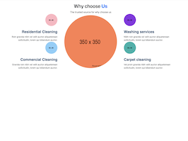
<h2 class="display-18 display-md-16 display-lg-14 font-weight-700">Why choose <strong class="text-primary font-weight-700">Us</strong></h2>
<span>The trusted source for why choose us</span>
</div>
<div class="row align-items-center">
<div class="col-sm-6 col-lg-4 mb-2-9 mb-sm-0">
<div class="pr-md-3">
<div class="text-center text-sm-right mb-2-9">
<div class="mb-4">
<img src="https://www.bootdey.com/image/80x80/FFB6C1/000000" alt="..." class="rounded-circle">
</div>
<h4 class="sub-info">Residential Cleaning</h4>
<p class="display-30 mb-0">Roin gravida nibh vel velit auctor aliquetenean sollicitudin, lorem qui bibendum auctor.</p>
</div>
<div class="text-center text-sm-right">
<div class="mb-4">
<img src="https://www.bootdey.com/image/80x80/87CEFA/000000" alt="..." class="rounded-circle">
</div>
<h4 class="sub-info">Commercial Cleaning</h4>
<p class="display-30 mb-0">Gravida roin nibh vel velit auctor aliquetenean sollicitudin, lorem qui bibendum auctor.</p>
</div>
</div>
</div>
<div class="col-lg-4 d-none d-lg-block">
<div class="why-choose-center-image">
<img src="https://www.bootdey.com/image/350x350/FF7F50/000000" alt="..." class="rounded-circle">
</div>
</div>
<div class="col-sm-6 col-lg-4">
<div class="pl-md-3">
<div class="text-center text-sm-left mb-2-9">
<div class="mb-4">
<img src="https://www.bootdey.com/image/80x80/8A2BE2/000000" alt="..." class="rounded-circle">
</div>
<h4 class="sub-info">Washing services</h4>
<p class="display-30 mb-0">Nibh roin gravida vel velit auctor aliquetenean sollicitudin, lorem qui bibendum auctor.</p>
</div>
<div class="text-center text-sm-left">
<div class="mb-4">
<img src="https://www.bootdey.com/image/80x80/20B2AA/000000" alt="..." class="rounded-circle">
</div>
<h4 class="sub-info">Carpet cleaning</h4>
<p class="display-30 mb-0">Vel proin gravida nibh velit auctor aliquetenean sollicitudin, lorem qui bibendum auctor.</p>
</div>
</div>
</div>
</div>
</div>CSS code
This is the css code used to create this bootstrap snippet, You can copy and paste the following css code inside a page with bootstrap 4.5.0 included, to get the result that you can see in the preview selection
Downloadbody{margin-top:20px;}
.rounded-circle {
border-radius: 50% !important;
}
img {
max-width: 100%;
height: auto;
vertical-align: top;
}
.sub-info{
font-weight: 600;
font-family: 'Poppins', sans-serif;
color: #004975;
}
.display-30 {
font-size: 0.9rem;
}
About this bootstrap example/template
This example/template, Why choose Us, was published on Sep 18th 2020, 16:13 by Bootdey Admin and it is free.
We hope you will enjoy this awesome snippet and stay tuned for the latest updates, bootdey snippets are already used in thousands of blogs, websites and projects. We believe it will save your precious time and gives trendy look to your next web project.
We always try to offer the best beautiful and responsive source of Bootstrap code examples and components.
This code example currectly have 17.9K views, Using this bootstrap snippet you have the following benefits:
Bootstrap 4.5.0
<link rel='stylesheet' href='https://cdn.jsdelivr.net/npm/[email protected]/dist/css/bootstrap.min.css'>
<script src='https://cdn.jsdelivr.net/npm/[email protected]/dist/js/bootstrap.bundle.min.js'></script>
This code example is based on bootstrap 4.5.0 and the grid system of this framework
Responsive
Based on bootstrap framework makes all the layouts perfectly responsive for all devices
Crossbrowser compatibility
Tested on all major browsers, it works smoothly on all of them
semantic html 5
Built on html / css3 the code quality is really amazing
Simple Integration
This code example can be simply integrated on existing sites and new ones too, all you need to do is copy the code and start working
