HTML code
Clean, semantic HTML that powers this Bootstrap 4.3.1 snippet. Copy and paste it into your page (with Bootstrap loaded) to reproduce the exact layout shown in the preview.
Download<!-- Services section -->
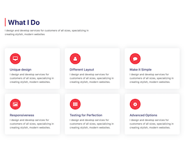
<section id="what-we-do">
<div class="container-fluid">
<h2 class="section-title mb-2 h1">What we do</h2>
<p class="text-center text-muted h5">Having and managing a correct marketing strategy is crucial in a fast moving market.</p>
<div class="row mt-5">
<div class="col-xs-12 col-sm-6 col-md-4 col-lg-4 col-xl-4">
<div class="card">
<div class="card-block block-1">
<h3 class="card-title">Special title</h3>
<p class="card-text">With supporting text below as a natural lead-in to additional content.</p>
<a href="https://www.fiverr.com/sunlimetech/design-and-fix-your-bootstrap-4-issues" title="Read more" class="read-more" >Read more<i class="fa fa-angle-double-right ml-2"></i></a>
</div>
</div>
</div>
<div class="col-xs-12 col-sm-6 col-md-4 col-lg-4 col-xl-4">
<div class="card">
<div class="card-block block-2">
<h3 class="card-title">Special title</h3>
<p class="card-text">With supporting text below as a natural lead-in to additional content.</p>
<a href="https://www.fiverr.com/sunlimetech/design-and-fix-your-bootstrap-4-issues" title="Read more" class="read-more" >Read more<i class="fa fa-angle-double-right ml-2"></i></a>
</div>
</div>
</div>
<div class="col-xs-12 col-sm-6 col-md-4 col-lg-4 col-xl-4">
<div class="card">
<div class="card-block block-3">
<h3 class="card-title">Special title</h3>
<p class="card-text">With supporting text below as a natural lead-in to additional content.</p>
<a href="https://www.fiverr.com/sunlimetech/design-and-fix-your-bootstrap-4-issues" title="Read more" class="read-more" >Read more<i class="fa fa-angle-double-right ml-2"></i></a>
</div>
</div>
</div>
</div>
<div class="row">
<div class="col-xs-12 col-sm-6 col-md-4 col-lg-4 col-xl-4">
<div class="card">
<div class="card-block block-4">
<h3 class="card-title">Special title</h3>
<p class="card-text">With supporting text below as a natural lead-in to additional content.</p>
<a href="https://www.fiverr.com/sunlimetech/design-and-fix-your-bootstrap-4-issues" title="Read more" class="read-more" >Read more<i class="fa fa-angle-double-right ml-2"></i></a>
</div>
</div>
</div>
<div class="col-xs-12 col-sm-6 col-md-4 col-lg-4 col-xl-4">
<div class="card">
<div class="card-block block-5">
<h3 class="card-title">Special title</h3>
<p class="card-text">With supporting text below as a natural lead-in to additional content.</p>
<a href="https://www.fiverr.com/sunlimetech/design-and-fix-your-bootstrap-4-issues" title="Read more" class="read-more" >Read more<i class="fa fa-angle-double-right ml-2"></i></a>
</div>
</div>
</div>
<div class="col-xs-12 col-sm-6 col-md-4 col-lg-4 col-xl-4">
<div class="card">
<div class="card-block block-6">
<h3 class="card-title">Special title</h3>
<p class="card-text">With supporting text below as a natural lead-in to additional content.</p>
<a href="https://www.fiverr.com/sunlimetech/design-and-fix-your-bootstrap-4-issues" title="Read more" class="read-more" >Read more<i class="fa fa-angle-double-right ml-2"></i></a>
</div>
</div>
</div>
</div>
</div>
</section>
<!-- /Services section -->CSS code
Scoped CSS that styles the component. Paste it after Bootstrap 4.3.1 to keep the design, spacing, and responsiveness consistent.
Download/**********************
/***** Services *******
/*********************/
@import url('https://maxcdn.bootstrapcdn.com/font-awesome/4.7.0/css/font-awesome.min.css');
section{
padding: 60px 0;
}
section .section-title{
text-align:center;
color:#007b5e;
margin-bottom:50px;
text-transform:uppercase;
}
#what-we-do{
background:#ffffff;
}
#what-we-do .card{
padding: 1rem!important;
border: none;
margin-bottom:1rem;
-webkit-transition: .5s all ease;
-moz-transition: .5s all ease;
transition: .5s all ease;
}
#what-we-do .card:hover{
-webkit-box-shadow: 5px 7px 9px -4px rgb(158, 158, 158);
-moz-box-shadow: 5px 7px 9px -4px rgb(158, 158, 158);
box-shadow: 5px 7px 9px -4px rgb(158, 158, 158);
}
#what-we-do .card .card-block{
padding-left: 50px;
position: relative;
}
#what-we-do .card .card-block a{
color: #007b5e !important;
font-weight:700;
text-decoration:none;
}
#what-we-do .card .card-block a i{
display:none;
}
#what-we-do .card:hover .card-block a i{
display:inline-block;
font-weight:700;
}
#what-we-do .card .card-block:before{
font-family: FontAwesome;
position: absolute;
font-size: 39px;
color: #007b5e;
left: 0;
-webkit-transition: -webkit-transform .2s ease-in-out;
transition:transform .2s ease-in-out;
}
#what-we-do .card .block-1:before{
content: "\f0e7";
}
#what-we-do .card .block-2:before{
content: "\f0eb";
}
#what-we-do .card .block-3:before{
content: "\f00c";
}
#what-we-do .card .block-4:before{
content: "\f209";
}
#what-we-do .card .block-5:before{
content: "\f0a1";
}
#what-we-do .card .block-6:before{
content: "\f218";
}
#what-we-do .card:hover .card-block:before{
-webkit-transform: rotate(360deg);
transform: rotate(360deg);
-webkit-transition: .5s all ease;
-moz-transition: .5s all ease;
transition: .5s all ease;
}FAQ
How do I use this snippet?
Include Bootstrap 4.3.1, paste the HTML, add the CSS block, and include the JS (if any) to mirror the live preview.
Can I use it in commercial projects?
Yes. It’s free for personal and commercial work; check the snippets license for details.
Is it responsive?
Yes. It inherits the responsive grid and components from Bootstrap 4.3.1.

About this bootstrap example/template
This free Bootstrap 4.3.1 snippet, Services section using bootstrap 4 bootdey, was published on Sep 28th 2019, 02:38 by Sunlime Technologies.
Optimized for copy‑paste: clean HTML, scoped CSS, and minimal JS so you can ship production‑ready UI faster and keep designs consistent.
Mobile‑first and responsive by default. Tested across modern browsers to reduce polish time on your project.
Already trusted in 5.6K+ views. Reuse this snippet to speed up landing pages, dashboards, or onboarding flows.
Bootstrap 4.3.1
<link rel='stylesheet' href='https://cdn.jsdelivr.net/npm/[email protected]/dist/css/bootstrap.min.css'>
<script src='https://cdn.jsdelivr.net/npm/[email protected]/dist/js/bootstrap.bundle.min.js'></script>
This code example is based on bootstrap 4.3.1 and the grid system of this framework
Responsive
Based on bootstrap framework makes all the layouts perfectly responsive for all devices
Crossbrowser compatibility
Tested on all major browsers, it works smoothly on all of them
semantic html 5
Built on html / css3 the code quality is really amazing
Simple Integration
This code example can be simply integrated on existing sites and new ones too, all you need to do is copy the code and start working
