HTML code
This is the html code used to create this bootstrap snippet, You can copy and paste the following html code inside a page with bootstrap 3.3.4 included, to get the result that you can see in the preview selection
Download<link href="https://maxcdn.bootstrapcdn.com/font-awesome/4.3.0/css/font-awesome.min.css" rel="stylesheet">
<div class="container bootstrap snippets bootdey">
<div class="row">
<div class="col-xs-12 col-sm-4 br-a br-light bg-light pv20 ph30">
<h4 class="micro-header">Select Content Type</h4>
<div class="row text-center" id="content-type">
<div class="col-xs-4 col-sm-6">
<a class="holder-style p15 mb20 holder-active" href="#dock-image">
<span class="fa fa-picture-o holder-icon"></span>
<br> Image
</a>
</div>
<div class="col-xs-4 col-sm-6">
<a class="holder-style p15 mb20" href="#dock-panel">
<span class="fa fa-text-height holder-icon"></span>
<br> Panel
</a>
</div>
<div class="col-xs-4 col-sm-6">
<a class="holder-style p15 mb20" href="#dock-table">
<span class="fa fa-pencil-square-o holder-icon"></span>
<br> Table
</a>
</div>
<div class="col-xs-4 col-sm-6">
<a class="holder-style p15 mb20" href="#dock-form">
<span class="fa fa-map-marker holder-icon"></span>
<br> Form
</a>
</div>
<div class="col-xs-4 col-sm-6">
<a class="holder-style p15 mb20" href="#dock-text">
<span class="fa fa-film holder-icon"></span>
<br> Text
</a>
</div>
<div class="col-xs-4 col-sm-6">
<a class="holder-style p15 mb20" href="#dock-video">
<span class="fa fa-spinner holder-icon"></span>
<br> Video
</a>
</div>
</div>
<button id="dock-push" type="button" class="btn btn-success fs14 fw600 pv15 btn-block">Send to Admin Dock</button>
</div>
<div class="col-xs-12 col-sm-8 br-a br-light bg-light dark">
<div id="dock-content" class="ph60">
<div id="dock-image" class="content active-content">
<div class="dock-item" data-title="Tiger Image">
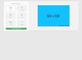
<img class="img-responsive center-block" src="https://www.bootdey.com/image/500x330/00BFFF/000000">
</div>
</div>
<div id="dock-panel" class="content">
PANEL
</div>
<div id="dock-table" class="content">
TABLE CONTENT
</div>
<div id="dock-form" class="content">
COOL FORM
</div>
<div id="dock-text" class="content">
AMAZING TEXT
</div>
<div id="dock-video" class="content">
AWESOME VIDEO
</div>
</div>
</div>
</div>
</div>CSS code
This is the css code used to create this bootstrap snippet, You can copy and paste the following css code inside a page with bootstrap 3.3.4 included, to get the result that you can see in the preview selection
Downloadbody{
margin-top:20px;
background:#e7e7e7;
}
.bg-light {
background-color: #FAFAFA;
color: #666;
}
.br-light {
border-color: #e7e7e7 !important;
}
.br-a {
border: 1px solid #eeeeee !important;
}
.ph30 {
padding-left: 30px !important;
padding-right: 30px !important;
}
.ph60 {
padding: 60px !important;
}
.pv20 {
padding-top: 20px !important;
padding-bottom: 20px !important;
}
.bg-light.dark {
background-color: #F2F2F2;
}
.micro-header {
color: #999;
text-align: center;
font-weight: 400;
margin-bottom: 20px;
}
h4, .h4 {
font-size: 15px;
}
.holder-style.holder-active {
background-color: #FFF;
border:2px dashed #70ca63;
}
.mb20 {
margin-bottom: 20px !important;
}
.p15 {
padding: 15px !important;
}
.holder-style {
display: block;
padding: 9px 16px;
color: #AAA;
background-color: #f1f1f1;
border: 2px dashed #d9d9d9;
-webkit-transition: all 0.15s ease;
-moz-transition: all 0.15s ease;
transition: all 0.15s ease;
}
.holder-style.holder-active .holder-icon {
color: #70ca63;
}
.holder-style .holder-icon {
color: #AAA;
font-size: 30px;
padding-bottom: 10px;
}
a, a:hover, a:focus{
text-decoration:none !important;
}Javascript/Jquery code
This is the javascript code used to create this bootstrap snippet, You can copy and paste the following javascript code inside a page with bootstrap 3.3.4 included, to get the result that you can see in the preview selection
Download$(function(){
$('.content').hide();
$('.active-content').show();
$('.holder-style').click(function(e){
e.preventDefault();
$('.holder-style').removeClass('holder-active');
$('.content').hide();
$($(this).attr('href')).show();
$(this).addClass('holder-active');
});
}); 
About this bootstrap example/template
This example/template, Select Content Type, was published on Jul 6th 2015, 14:30 by Bootdey Admin and it is free.
We hope you will enjoy this awesome snippet and stay tuned for the latest updates, bootdey snippets are already used in thousands of blogs, websites and projects. We believe it will save your precious time and gives trendy look to your next web project.
We always try to offer the best beautiful and responsive source of Bootstrap code examples and components.
This code example currectly have 10.3K views, Using this bootstrap snippet you have the following benefits:
Bootstrap 3.3.4
<link rel='stylesheet' href='https://netdna.bootstrapcdn.com/bootstrap/3.3.4/css/bootstrap.min.css'>
<script src='https://netdna.bootstrapcdn.com/bootstrap/3.3.4/js/bootstrap.min.js'></script>
This code example is based on bootstrap 3.3.4 and the grid system of this framework
Responsive
Based on bootstrap framework makes all the layouts perfectly responsive for all devices
Crossbrowser compatibility
Tested on all major browsers, it works smoothly on all of them
Jquery plugins
Great built-in plugins with jquery framework, you can easy to change all declarations
semantic html 5
Built on html / css3 the code quality is really amazing
Simple Integration
This code example can be simply integrated on existing sites and new ones too, all you need to do is copy the code and start working
