HTML code
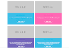
This is the html code used to create this bootstrap snippet, You can copy and paste the following html code inside a page with bootstrap 3.3.6 included, to get the result that you can see in the preview selection
Download<div class="container">
<div class="row">
<div class="col-md-6 news-item">
<img src="https://www.bootdey.com/image/400x400/" alt="news">
<div class="decor-info descr">
<h5 class="m-b-md"><a href="#">Name of the article in one row</a></h5>
<p>Lorem ipsum dolor sit amet, consectetur adipisicing elit. Magni dolore alias doloremque, impedit enim tenetur, esse mollitia repellendus nemo, rem recusandae quisquam quam.</p>
<a class="readmore" href="#">Read more</a>
</div>
</div>
<div class="col-md-6 news-item">
<img src="https://www.bootdey.com/image/400x400/" alt="news">
<div class="decor-danger descr">
<h5 class="m-b-md"><a href="#">Name of the article in one row</a></h5>
<p>Lorem ipsum dolor sit amet, consectetur adipisicing elit. Magni dolore alias doloremque, impedit enim tenetur, esse mollitia repellendus nemo, rem recusandae quisquam quam.</p>
<a class="readmore" href="#">Read more</a>
</div>
</div>
</div>
<div class="row">
<div class="col-md-6 news-item">
<img src="https://www.bootdey.com/image/400x400/" alt="news">
<div class="decor-primary descr">
<h5 class="m-b-md"><a href="#">Name of the article in one row</a></h5>
<p>Lorem ipsum dolor sit amet, consectetur adipisicing elit. Magni dolore alias doloremque, impedit enim tenetur, esse mollitia repellendus nemo, rem recusandae quisquam quam.</p>
<a class="readmore" href="#">Read more</a>
</div>
</div>
<div class="col-md-6 news-item">
<img src="https://www.bootdey.com/image/400x400/" alt="news">
<div class="decor-info descr">
<h5 class="m-b-md"><a href="#">Name of the article in one row</a></h5>
<p>Lorem ipsum dolor sit amet, consectetur adipisicing elit. Magni dolore alias doloremque, impedit enim tenetur, esse mollitia repellendus nemo, rem recusandae quisquam quam.</p>
<a class="readmore" href="#">Read more</a>
</div>
</div>
</div>
</div>CSS code
This is the css code used to create this bootstrap snippet, You can copy and paste the following css code inside a page with bootstrap 3.3.6 included, to get the result that you can see in the preview selection
Download
body{margin-top:20px;}
.news-item img {
    width: 100%;
    max-height: 250px;
    height: 250px;
    overflow: hidden;
    object-fit: cover;
}

.news-item .descr {
    padding: 30px;
    color: #fff;
    text-align: center;
    height: 250px;
}

.decor-success {
    background-color: #46be8a !important;
}

.decor-info {
    background-color: #39bee8 !important;
}

.decor-primary {
    background-color: #7266ba !important;
}

.decor-warning {
    background-color: #f2a654 !important;
}

.decor-danger {
    background-color: #ff69b4 !important;
}

.decor-primary-hue {
    background-color: #585b9c !important;
}

.news-item .descr h5 a {
    color: #fff;
    text-decoration: none;
}

.m-b-md, .news-item {
    margin-bottom: 30px !important;
}

.news-item .descr a.readmore:hover {
    text-decoration: none;
}
.news-item .descr a.readmore {
    display: inline-block;
    border: 1px solid #fff;
    border-radius: 30px;
    color: #fff;
    font-size: 24px;
    padding: 8px 22px;
}
About this bootstrap example/template
This example/template, News Widget, was published on Mar 24th 2016, 00:07 by Bootdey Admin and it is free.
We hope you will enjoy this awesome snippet and stay tuned for the latest updates, bootdey snippets are already used in thousands of blogs, websites and projects. We believe it will save your precious time and gives trendy look to your next web project.
We always try to offer the best beautiful and responsive source of Bootstrap code examples and components.
This code example currectly have 5.0K views, Using this bootstrap snippet you have the following benefits:
Bootstrap 3.3.6
<link rel='stylesheet' href='https://netdna.bootstrapcdn.com/bootstrap/3.3.6/css/bootstrap.min.css'>
<script src='https://netdna.bootstrapcdn.com/bootstrap/3.3.6/js/bootstrap.min.js'></script>
This code example is based on bootstrap 3.3.6 and the grid system of this framework
Responsive
Based on bootstrap framework makes all the layouts perfectly responsive for all devices
Crossbrowser compatibility
Tested on all major browsers, it works smoothly on all of them
semantic html 5
Built on html / css3 the code quality is really amazing
Simple Integration
This code example can be simply integrated on existing sites and new ones too, all you need to do is copy the code and start working
