HTML code
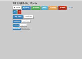
This is the html code used to create this bootstrap snippet, You can copy and paste the following html code inside a page with bootstrap 3.0.0 included, to get the result that you can see in the preview selection
Download<div class="container bootstrap snippets bootdey">
<div class="row">
<h2>CSS3 3D Button Effects</h2>
<!-- Standard button -->
<button type="button" class="btn3d btn btn-default btn-lg"><span class="glyphicon glyphicon-download-alt"></span> Default</button>
<!-- Provides extra visual weight and identifies the primary action in a set of buttons -->
<button type="button" class="btn btn-primary btn-lg btn3d"><span class="glyphicon glyphicon-cloud"></span> Primary</button>
<!-- Indicates a successful or positive action -->
<button type="button" class="btn btn-success btn-lg btn3d"><span class="glyphicon glyphicon-ok"></span> Success</button>
<!-- Contextual button for informational alert messages -->
<button type="button" class="btn btn-info btn-lg btn3d"><span class="glyphicon glyphicon-question-sign"></span> Info</button>
<!-- Indicates caution should be taken with this action -->
<button type="button" class="btn btn-warning btn-lg btn3d"><span class="glyphicon glyphicon-warning-sign"></span> Warning</button>
<!-- Indicates a dangerous or potentially negative action -->
<button type="button" class="btn btn-danger btn-lg btn3d"><span class="glyphicon glyphicon-remove"></span> Danger</button>
<!-- Deemphasize a button by making it look like a link while maintaining button behavior -->
<a href="http://www.jquery2dotnet.com/" class="btn btn-link btn-lg btn3d" role="button"><span class="glyphicon glyphicon-globe"></span> Link</a>
<p>
<button type="button" class="btn btn-primary btn-lg btn3d"><span class="glyphicon glyphicon-thumbs-up"></span></button>
<button type="button" class="btn btn-danger btn-lg btn3d"><span class="glyphicon glyphicon-off"></span></button>
</p>
<p>
<button type="button" class="btn btn-primary btn-lg btn3d">Large button</button>
<button type="button" class="btn btn-default btn-lg btn3d">Large button</button>
</p>
<p>
<button type="button" class="btn btn-primary btn3d">Default button</button>
<button type="button" class="btn btn-default btn3d">Default button</button>
</p>
<p>
<button type="button" class="btn btn-primary btn-sm btn3d">Small button</button>
<button type="button" class="btn btn-default btn-sm btn3d">Small button</button>
</p>
<p>
<button type="button" class="btn btn-primary btn-xs btn3d">Extra small button</button>
<button type="button" class="btn btn-default btn-xs btn3d">Extra small button</button>
</p>
</div>
</div>CSS code
This is the css code used to create this bootstrap snippet, You can copy and paste the following css code inside a page with bootstrap 3.0.0 included, to get the result that you can see in the preview selection
Download.btn3d {
transition:all .08s linear;
position:relative;
outline:medium none;
-moz-outline-style:none;
border:0px;
margin-right:10px;
margin-top:15px;
}
.btn3d:focus {
outline:medium none;
-moz-outline-style:none;
}
.btn3d:active {
top:9px;
}
.btn-default {
box-shadow:0 0 0 1px #ebebeb inset, 0 0 0 2px rgba(255,255,255,0.15) inset, 0 8px 0 0 #adadad, 0 8px 0 1px rgba(0,0,0,0.4), 0 8px 8px 1px rgba(0,0,0,0.5);
background-color:#fff;
}
.btn-primary {
box-shadow:0 0 0 1px #428bca inset, 0 0 0 2px rgba(255,255,255,0.15) inset, 0 8px 0 0 #357ebd, 0 8px 0 1px rgba(0,0,0,0.4), 0 8px 8px 1px rgba(0,0,0,0.5);
background-color:#428bca;
}
.btn-success {
box-shadow:0 0 0 1px #5cb85c inset, 0 0 0 2px rgba(255,255,255,0.15) inset, 0 8px 0 0 #4cae4c, 0 8px 0 1px rgba(0,0,0,0.4), 0 8px 8px 1px rgba(0,0,0,0.5);
background-color:#5cb85c;
}
.btn-info {
box-shadow:0 0 0 1px #5bc0de inset, 0 0 0 2px rgba(255,255,255,0.15) inset, 0 8px 0 0 #46b8da, 0 8px 0 1px rgba(0,0,0,0.4), 0 8px 8px 1px rgba(0,0,0,0.5);
background-color:#5bc0de;
}
.btn-warning {
box-shadow:0 0 0 1px #f0ad4e inset, 0 0 0 2px rgba(255,255,255,0.15) inset, 0 8px 0 0 #eea236, 0 8px 0 1px rgba(0,0,0,0.4), 0 8px 8px 1px rgba(0,0,0,0.5);
background-color:#f0ad4e;
}
.btn-danger {
box-shadow:0 0 0 1px #c63702 inset, 0 0 0 2px rgba(255,255,255,0.15) inset, 0 8px 0 0 #C24032, 0 8px 0 1px rgba(0,0,0,0.4), 0 8px 8px 1px rgba(0,0,0,0.5);
background-color:#c63702;
}
About this bootstrap example/template
This example/template, Full bootsra 3d Buttons, was published on Apr 11th 2014, 20:58 by Bootdey Admin and it is free.
We hope you will enjoy this awesome snippet and stay tuned for the latest updates, bootdey snippets are already used in thousands of blogs, websites and projects. We believe it will save your precious time and gives trendy look to your next web project.
We always try to offer the best beautiful and responsive source of Bootstrap code examples and components.
This code example currectly have 12.4K views, Using this bootstrap snippet you have the following benefits:
Bootstrap 3.0.0
<link rel='stylesheet' href='https://netdna.bootstrapcdn.com/bootstrap/3.0.0/css/bootstrap.min.css'>
<script src='https://netdna.bootstrapcdn.com/bootstrap/3.0.0/js/bootstrap.min.js'></script>
This code example is based on bootstrap 3.0.0 and the grid system of this framework
Responsive
Based on bootstrap framework makes all the layouts perfectly responsive for all devices
Crossbrowser compatibility
Tested on all major browsers, it works smoothly on all of them
semantic html 5
Built on html / css3 the code quality is really amazing
Simple Integration
This code example can be simply integrated on existing sites and new ones too, all you need to do is copy the code and start working
