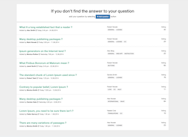
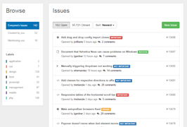
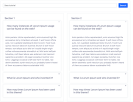
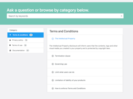
HTML code
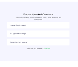
This is the html code used to create this bootstrap snippet, You can copy and paste the following html code inside a page with bootstrap 4.5.0 included, to get the result that you can see in the preview selection
Download
<div class="faq_area section_padding_130" id="faq">
<div class="container">
<div class="row justify-content-center">
<div class="col-12 col-sm-8 col-lg-6">
<!-- Section Heading-->
<div class="section_heading text-center wow fadeInUp" data-wow-delay="0.2s" style="visibility: visible; animation-delay: 0.2s; animation-name: fadeInUp;">
<h3><span>Frequently </span> Asked Questions</h3>
<p>Appland is completely creative, lightweight, clean & super responsive app landing page.</p>
<div class="line"></div>
</div>
</div>
</div>
<div class="row justify-content-center">
<!-- FAQ Area-->
<div class="col-12 col-sm-10 col-lg-8">
<div class="accordion faq-accordian" id="faqAccordion">
<div class="card border-0 wow fadeInUp" data-wow-delay="0.2s" style="visibility: visible; animation-delay: 0.2s; animation-name: fadeInUp;">
<div class="card-header" id="headingOne">
<h6 class="mb-0 collapsed" data-toggle="collapse" data-target="#collapseOne" aria-expanded="true" aria-controls="collapseOne">How can I install this app?<span class="lni-chevron-up"></span></h6>
</div>
<div class="collapse" id="collapseOne" aria-labelledby="headingOne" data-parent="#faqAccordion">
<div class="card-body">
<p>Lorem ipsum dolor sit amet consectetur adipisicing elit. Architecto quidem facere deserunt sint animi sapiente vitae suscipit.</p>
<p>Appland is completely creative, lightweight, clean & super responsive app landing page.</p>
</div>
</div>
</div>
<div class="card border-0 wow fadeInUp" data-wow-delay="0.3s" style="visibility: visible; animation-delay: 0.3s; animation-name: fadeInUp;">
<div class="card-header" id="headingTwo">
<h6 class="mb-0 collapsed" data-toggle="collapse" data-target="#collapseTwo" aria-expanded="true" aria-controls="collapseTwo">The apps isn't installing?<span class="lni-chevron-up"></span></h6>
</div>
<div class="collapse" id="collapseTwo" aria-labelledby="headingTwo" data-parent="#faqAccordion">
<div class="card-body">
<p>Lorem ipsum dolor sit amet consectetur adipisicing elit. Architecto quidem facere deserunt sint animi sapiente vitae suscipit.</p>
<p>Appland is completely creative, lightweight, clean & super responsive app landing page.</p>
</div>
</div>
</div>
<div class="card border-0 wow fadeInUp" data-wow-delay="0.4s" style="visibility: visible; animation-delay: 0.4s; animation-name: fadeInUp;">
<div class="card-header" id="headingThree">
<h6 class="mb-0 collapsed" data-toggle="collapse" data-target="#collapseThree" aria-expanded="true" aria-controls="collapseThree">Contact form isn't working?<span class="lni-chevron-up"></span></h6>
</div>
<div class="collapse" id="collapseThree" aria-labelledby="headingThree" data-parent="#faqAccordion">
<div class="card-body">
<p>Lorem ipsum dolor sit amet consectetur adipisicing elit. Architecto quidem facere deserunt sint animi sapiente vitae suscipit.</p>
<p>Appland is completely creative, lightweight, clean & super responsive app landing page.</p>
</div>
</div>
</div>
</div>
<!-- Support Button-->
<div class="support-button text-center d-flex align-items-center justify-content-center mt-4 wow fadeInUp" data-wow-delay="0.5s" style="visibility: visible; animation-delay: 0.5s; animation-name: fadeInUp;">
<i class="lni-emoji-sad"></i>
<p class="mb-0 px-2">Can't find your answers?</p>
<a href="#"> Contact us</a>
</div>
</div>
</div>
</div>
</div>
CSS code
This is the css code used to create this bootstrap snippet, You can copy and paste the following css code inside a page with bootstrap 4.5.0 included, to get the result that you can see in the preview selection
Downloadbody{margin-top:20px;}
.section_padding_130 {
padding-top: 130px;
padding-bottom: 130px;
}
.faq_area {
position: relative;
z-index: 1;
background-color: #f5f5ff;
}
.faq-accordian {
position: relative;
z-index: 1;
}
.faq-accordian .card {
position: relative;
z-index: 1;
margin-bottom: 1.5rem;
}
.faq-accordian .card:last-child {
margin-bottom: 0;
}
.faq-accordian .card .card-header {
background-color: #ffffff;
padding: 0;
border-bottom-color: #ebebeb;
}
.faq-accordian .card .card-header h6 {
cursor: pointer;
padding: 1.75rem 2rem;
color: #3f43fd;
display: -webkit-box;
display: -ms-flexbox;
display: flex;
-webkit-box-align: center;
-ms-flex-align: center;
-ms-grid-row-align: center;
align-items: center;
-webkit-box-pack: justify;
-ms-flex-pack: justify;
justify-content: space-between;
}
.faq-accordian .card .card-header h6 span {
font-size: 1.5rem;
}
.faq-accordian .card .card-header h6.collapsed {
color: #070a57;
}
.faq-accordian .card .card-header h6.collapsed span {
-webkit-transform: rotate(-180deg);
transform: rotate(-180deg);
}
.faq-accordian .card .card-body {
padding: 1.75rem 2rem;
}
.faq-accordian .card .card-body p:last-child {
margin-bottom: 0;
}
@media only screen and (max-width: 575px) {
.support-button p {
font-size: 14px;
}
}
.support-button i {
color: #3f43fd;
font-size: 1.25rem;
}
@media only screen and (max-width: 575px) {
.support-button i {
font-size: 1rem;
}
}
.support-button a {
text-transform: capitalize;
color: #2ecc71;
}
@media only screen and (max-width: 575px) {
.support-button a {
font-size: 13px;
}
}
About this bootstrap example/template
This example/template, Frequently Asked Questions section, was published on Oct 14th 2020, 10:37 by Bootdey Admin and it is free.
We hope you will enjoy this awesome snippet and stay tuned for the latest updates, bootdey snippets are already used in thousands of blogs, websites and projects. We believe it will save your precious time and gives trendy look to your next web project.
We always try to offer the best beautiful and responsive source of Bootstrap code examples and components.
This code example currectly have 22.5K views, Using this bootstrap snippet you have the following benefits:
Bootstrap 4.5.0
<link rel='stylesheet' href='https://cdn.jsdelivr.net/npm/[email protected]/dist/css/bootstrap.min.css'>
<script src='https://cdn.jsdelivr.net/npm/[email protected]/dist/js/bootstrap.bundle.min.js'></script>
This code example is based on bootstrap 4.5.0 and the grid system of this framework
Responsive
Based on bootstrap framework makes all the layouts perfectly responsive for all devices
Crossbrowser compatibility
Tested on all major browsers, it works smoothly on all of them
semantic html 5
Built on html / css3 the code quality is really amazing
Simple Integration
This code example can be simply integrated on existing sites and new ones too, all you need to do is copy the code and start working
