HTML code
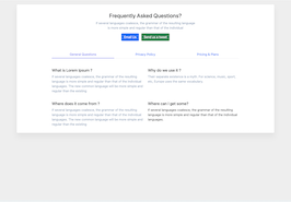
This is the html code used to create this bootstrap snippet, You can copy and paste the following html code inside a page with bootstrap 5.1.3 included, to get the result that you can see in the preview selection
Download<div class="container">
<div class="row">
<div class="col-lx-12">
<div class="card">
<div class="card-body">
<div class="row justify-content-center mt-4">
<div class="col-xl-5 col-lg-8">
<div class="text-center">
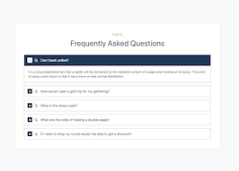
<h3>Frequently Asked Questions?</h3>
<p class="text-muted">If several languages coalesce, the grammar of the resulting language
is more simple and regular than that of the individual</p>
<div>
<button type="button" class="btn btn-primary me-2">Email Us</button>
<button type="button" class="btn btn-success">Send us a tweet</button>
</div>
</div>
</div>
<!-- end col -->
</div>
<!-- end row -->
<div class="row justify-content-center mt-5">
<div class="col-9">
<ul class="nav nav-tabs nav-tabs-custom nav-justified justify-content-center faq-tab-box" id="pills-tab" role="tablist">
<li class="nav-item" role="presentation">
<button class="nav-link active" id="pills-genarel-tab" data-bs-toggle="pill" data-bs-target="#pills-genarel" type="button" role="tab" aria-controls="pills-genarel" aria-selected="true">
<span class="font-size-16">General Questions</span>
</button>
</li>
<li class="nav-item" role="presentation">
<button class="nav-link" id="pills-privacy_policy-tab" data-bs-toggle="pill" data-bs-target="#pills-privacy_policy" type="button" role="tab" aria-controls="pills-privacy_policy" aria-selected="false">
<span class="font-size-16">Privacy Policy</span>
</button>
</li>
<li class="nav-item" role="presentation">
<button class="nav-link" id="pills-teachers-tab" data-bs-toggle="pill" data-bs-target="#pills-pricing_plan" type="button" role="tab" aria-controls="pills-pricing_plan" aria-selected="false">
<span class="font-size-16">Pricing & Plans</span>
</button>
</li>
</ul>
</div>
<div class="col-lg-9">
<div class="tab-content pt-3" id="pills-tabContent">
<div class="tab-pane fade active show" id="pills-genarel" role="tabpanel" aria-labelledby="pills-genarel-tab">
<div class="row g-4 mt-2">
<div class="col-lg-6">
<h5>What is Lorem Ipsum ?</h5>
<p class="text-muted">If several languages coalesce, the grammar of the resulting language is more simple
and regular than that of the individual languages. The new common language will be more simple and
regular than the existing</p>
</div>
<div class="col-lg-6">
<h5>Why do we use it ?</h5>
<p class="text-muted">Their separate existence is a myth. For science, music, sport, etc,
Europe uses the same vocabulary.</p>
</div>
<div class="col-lg-6">
<h5>Where does it come from ?</h5>
<p class="text-muted">If several languages coalesce, the grammar of the resulting language is more simple
and regular than that of the individual languages. The new common language will be more simple and
regular than the existing
</p>
</div>
<div class="col-lg-6">
<h5>Where can I get some?</h5>
<p class="lg-base">If several languages coalesce, the grammar of the resulting language is more
simple and regular than that of the individual languages. </p>
</div>
</div>
</div>
<div class="tab-pane fade" id="pills-privacy_policy" role="tabpanel" aria-labelledby="pills-privacy_policy-tab">
<div class="row g-4 mt-2">
<div class="col-lg-6">
<h5>Where can I get some ?</h5>
<p class="lg-base">If several languages coalesce, the grammar of the resulting language is more simple
and regular than that of the individual languages. The new common language will be more
simple and regular than the existing</p>
</div>
<div class="col-lg-6">
<h5>Where does it come from ?</h5>
<p class="lg-base">If several languages coalesce, the grammar of the resulting language is more simple
and regular than that of the individual languages. The new common language will be more
simple and regular than the existing</p>
</div>
<div class="col-lg-6">
<h5>Why do we use it ?</h5>
<p class="lg-base">If several languages coalesce, the grammar of the resulting language is more simple
and regular than that of the individual languages. The new common language will be more
simple and regular than the existing</p>
</div>
<div class="col-lg-6">
<h5>What is Genius privacy policy</h5>
<p class="lg-base">If several languages coalesce, the grammar of the resulting language is more simple
and regular than that of the individual languages. The new common language will be more
simple and regular than the existing</p>
</div>
</div>
</div>
<div class="tab-pane fade" id="pills-pricing_plan" role="tabpanel">
<div class="row g-4 mt-4">
<div class="col-lg-6">
<h5>Where does it come from ?</h5>
<p class="lg-base">If several languages coalesce, the grammar of the resulting language is more simple
and regular than that of the individual languages. The new common language will be more
simple and regular than the existing</p>
</div>
<div class="col-lg-6">
<h5>Why do we use it ?</h5>
<p class="lg-base">If several languages coalesce, the grammar of the resulting language is more simple
and regular than that of the individual languages. The new common language will be more
simple and regular than the existing</p>
</div>
<div class="col-lg-6">
<h5>What is Lorem Ipsum ?</h5>
<p class="lg-base">If several languages coalesce, the grammar of the resulting language is more simple
and regular than that of the individual languages. The new common language will be more
simple and regular than the existing</p>
</div>
<div class="col-lg-6">
<h5>What is Lorem Ipsum?</h5>
<p class="lg-base">If several languages coalesce, the grammar of the resulting language is more simple
and regular than that of the individual languages. The new common language will be more
simple and regular than the existing</p>
</div>
</div>
</div>
</div>
</div>
</div>
<!-- end row -->
</div>
</div>
</div>
</div>
</div>CSS code
This is the css code used to create this bootstrap snippet, You can copy and paste the following css code inside a page with bootstrap 5.1.3 included, to get the result that you can see in the preview selection
Downloadbody{
background-color:#eee;
margin-top:20px;
}
.card {
box-shadow: 0 20px 27px 0 rgb(0 0 0 / 5%);
}
.nav-tabs-custom .nav-item .nav-link.active {
color: #6c6ff5;
}
.nav-tabs-custom .nav-item .nav-link {
border: none;
}
.text-muted {
color: #8ca3bd!important;
}
.nav-tabs-custom .nav-item {
position: relative;
color: #271050;
}
.nav-tabs-custom .nav-item .nav-link.active:after {
-webkit-transform: scale(1);
transform: scale(1);
}
.nav-tabs-custom .nav-item .nav-link::after {
content: "";
background: #6c6ff5;
height: 2px;
position: absolute;
width: 100%;
left: 0;
bottom: -1px;
-webkit-transition: all 250ms ease 0s;
transition: all 250ms ease 0s;
-webkit-transform: scale(0);
transform: scale(0);
}
About this bootstrap example/template
This example/template, Faqs frequently asked questions with tabs, was published on Mar 25th 2022, 11:15 by Bootdey Admin and it is free.
We hope you will enjoy this awesome snippet and stay tuned for the latest updates, bootdey snippets are already used in thousands of blogs, websites and projects. We believe it will save your precious time and gives trendy look to your next web project.
We always try to offer the best beautiful and responsive source of Bootstrap code examples and components.
This code example currectly have 12.0K views, Using this bootstrap snippet you have the following benefits:
Bootstrap 5.1.3
<link rel='stylesheet' href='https://cdn.jsdelivr.net/npm/[email protected]/dist/css/bootstrap.min.css'>
<script src='https://cdn.jsdelivr.net/npm/[email protected]/dist/js/bootstrap.bundle.min.js'></script>
This code example is based on bootstrap 5.1.3 and the grid system of this framework
Responsive
Based on bootstrap framework makes all the layouts perfectly responsive for all devices
Crossbrowser compatibility
Tested on all major browsers, it works smoothly on all of them
semantic html 5
Built on html / css3 the code quality is really amazing
Simple Integration
This code example can be simply integrated on existing sites and new ones too, all you need to do is copy the code and start working
