HTML code
This is the html code used to create this bootstrap snippet, You can copy and paste the following html code inside a page with bootstrap 3.3.6 included, to get the result that you can see in the preview selection
Download<link rel="stylesheet" href="https://daneden.github.io/animate.css/animate.min.css" />
<link href="https://maxcdn.bootstrapcdn.com/font-awesome/4.3.0/css/font-awesome.min.css" rel="stylesheet">
<div class="creative-member-area fix">
<div class="container">
<!-- section-heading start -->
<div class="row">
<div class="col-md-12">
<div class="section-heading fadeInUp animated">
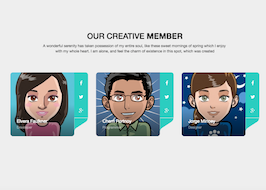
<h2>OUR CREATIVE <strong>MEMBER</strong></h2>
<p>A wonderful serenity has taken possession of my entire soul, like these sweet mornings of spring which I enjoy <br> with my whole heart. I am alone, and feel the charm of existence in this spot, which was created</p>
</div>
</div>
</div>
<!-- section-heading end -->
<div class="row">
<!-- single-creative-member start -->
<div class="col-xs-12 col-sm-4 col-md-4 col-lg-4">
<div class="single-creative-member fadeInUp animated">
<div class="member-photo">
<img src="https://bootdey.com/img/Content/avatar/avatar5.png" alt="">
</div>
<div class="member-info">
<span class="member-name">Elvera Faulkner</span>
<span class="member-role">Developer</span>
</div>
<div class="member-icons">
<a href="#"><i class="fa fa-facebook"></i></a>
<a href="#"><i class="fa fa-twitter"></i></a>
<a href="#"><i class="fa fa-google-plus"></i></a>
<svg version="1.1" xmlns="http://www.w3.org/2000/svg" xmlns:xlink="http://www.w3.org/1999/xlink" x="0px" y="0px" width="52px" height="52px" viewBox="0 0 52 52" enable-background="new 0 0 52 52" xml:space="preserve"><path d="M51.673,0H0v51.5c0.244-5.359,3.805-10.412,7.752-13.003l36.169-23.74c4.264-2.799,7.761-8.663,7.752-14.297V0L51.673,0z"></path></svg>
</div>
</div>
</div>
<!-- single-creative-member end -->
<!-- single-creative-member start -->
<div class="col-xs-12 col-sm-4 col-md-4 col-lg-4">
<div class="single-creative-member fadeInUp animated">
<div class="member-photo">
<img src="https://bootdey.com/img/Content/avatar/avatar2.png" alt="">
</div>
<div class="member-info">
<span class="member-name">Cherri Portnoy</span>
<span class="member-role">Programmer</span>
</div>
<div class="member-icons">
<a href="#"><i class="fa fa-facebook"></i></a>
<a href="#"><i class="fa fa-twitter"></i></a>
<a href="#"><i class="fa fa-google-plus"></i></a>
<svg version="1.1" xmlns="http://www.w3.org/2000/svg" xmlns:xlink="http://www.w3.org/1999/xlink" x="0px" y="0px" width="52px" height="52px" viewBox="0 0 52 52" enable-background="new 0 0 52 52" xml:space="preserve"><path d="M51.673,0H0v51.5c0.244-5.359,3.805-10.412,7.752-13.003l36.169-23.74c4.264-2.799,7.761-8.663,7.752-14.297V0L51.673,0z"></path></svg>
</div>
</div>
</div>
<!-- single-creative-member end -->
<!-- single-creative-member start -->
<div class="col-xs-12 col-sm-4 col-md-4 col-lg-4">
<div class="single-creative-member fadeInUp animated">
<div class="member-photo">
<img src="https://bootdey.com/img/Content/avatar/avatar3.png" alt="">
</div>
<div class="member-info">
<span class="member-name">Jorge Mincey</span>
<span class="member-role">Designer</span>
</div>
<div class="member-icons">
<a href="#"><i class="fa fa-facebook"></i></a>
<a href="#"><i class="fa fa-twitter"></i></a>
<a href="#"><i class="fa fa-google-plus"></i></a>
<svg version="1.1" xmlns="http://www.w3.org/2000/svg" xmlns:xlink="http://www.w3.org/1999/xlink" x="0px" y="0px" width="52px" height="52px" viewBox="0 0 52 52" enable-background="new 0 0 52 52" xml:space="preserve"><path d="M51.673,0H0v51.5c0.244-5.359,3.805-10.412,7.752-13.003l36.169-23.74c4.264-2.799,7.761-8.663,7.752-14.297V0L51.673,0z"></path></svg>
</div>
</div>
</div>
<!-- single-creative-member end -->
</div>
</div>
</div>CSS code
This is the css code used to create this bootstrap snippet, You can copy and paste the following css code inside a page with bootstrap 3.3.6 included, to get the result that you can see in the preview selection
Downloadbody{
background:#eee;
}
/*------------------------------
8. creative-member-area
--------------------------------*/
img {
max-width: 100%;
height: auto;
}
.creative-member-area {
padding: 160px 0;
}
.creative-member-area .section-heading {
text-align: center;
margin-bottom: 70px;
}
.creative-member-area .section-heading h2 {
color: #000;
}
.single-creative-member {
position: relative;
}
.member-photo {
border-radius: 10px 0 10px 10px;
margin-right: 52px;
overflow: hidden;
position: relative;
transform: translateZ(0px);
}
.member-photo::before {
background: rgba(0, 0, 0, 0.2) none repeat scroll 0 0;
content: "";
height: 100%;
left: 0;
opacity: 0;
position: absolute;
top: 0;
transition: opacity 0.3s ease 0s;
width: 100%;
}
.single-creative-member:hover .member-photo:before{opacity:1}
.member-photo::after {
background: rgba(0, 0, 0, 0) linear-gradient(to bottom, rgba(255, 255, 255, 0) 0%, rgba(255, 255, 255, 0) 0%, rgba(0, 0, 0, 0.5) 100%) repeat scroll 0 0;
bottom: 0;
content: "";
height: 50%;
left: 0;
position: absolute;
width: 100%;
}
.member-photo img{}
.member-info {
background: transparent none repeat scroll 0 0;
bottom: 0;
color: #fff;
margin-right: 50px;
padding: 25px;
position: absolute;
z-index: 999;
}
.member-info .member-name {
display: block;
font-size: 1.2em;
margin-bottom: 0.2em;
}
.member-info .member-role {
display: block;
font-size: 0.9em;
margin-bottom: 0;
opacity: 0.5;
}
.member-icons {
background-color: #2bcdc0;
border-radius: 0 10px 0 0;
padding: 15px 0 0;
position: absolute;
right: 0px;
top: 0;
width: 52px;
}
.member-icons a {
color: #fff;
display: inline-block;
font-size: 18px;
line-height: 52px;
margin: 0;
text-align: center;
text-decoration: none;
width: 100%;
}
.member-icons a i {
font-size: 18px;
padding-bottom: 15px;
width: 25px;
}
.member-icons svg {
border-top: 1px solid #eee;
position: absolute;
right: 0;
top: 100%;
}
.member-icons svg path{fill: #2bcdc0;}
About this bootstrap example/template
This example/template, Creative Member Area, was published on Aug 3rd 2016, 16:50 by Bootdey Admin and it is free.
We hope you will enjoy this awesome snippet and stay tuned for the latest updates, bootdey snippets are already used in thousands of blogs, websites and projects. We believe it will save your precious time and gives trendy look to your next web project.
We always try to offer the best beautiful and responsive source of Bootstrap code examples and components.
This code example currectly have 7.6K views, Using this bootstrap snippet you have the following benefits:
Bootstrap 3.3.6
<link rel='stylesheet' href='https://netdna.bootstrapcdn.com/bootstrap/3.3.6/css/bootstrap.min.css'>
<script src='https://netdna.bootstrapcdn.com/bootstrap/3.3.6/js/bootstrap.min.js'></script>
This code example is based on bootstrap 3.3.6 and the grid system of this framework
Responsive
Based on bootstrap framework makes all the layouts perfectly responsive for all devices
Crossbrowser compatibility
Tested on all major browsers, it works smoothly on all of them
semantic html 5
Built on html / css3 the code quality is really amazing
Simple Integration
This code example can be simply integrated on existing sites and new ones too, all you need to do is copy the code and start working


