HTML code
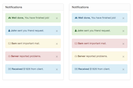
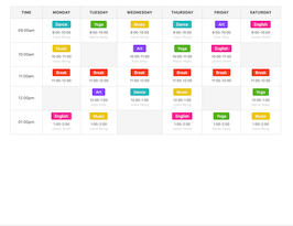
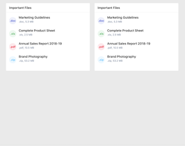
This is the html code used to create this bootstrap snippet, You can copy and paste the following html code inside a page with bootstrap 3.2.0 included, to get the result that you can see in the preview selection
Download
    <link rel="stylesheet" href="https://maxcdn.bootstrapcdn.com/font-awesome/4.6.3/css/font-awesome.min.css" type="text/css"/>

    <link href="https://fonts.googleapis.com/css?family=PT+Sans+Narrow" rel="stylesheet">
<div class="container">
    <div class="row">
        <div class="col-md-offset-1 col-md-10">
            <h2 class=" text-white">Bootstrap Accordion</h2>
            <span class="loader pull-right"><span class="loader-inner"></span></span>
            <hr></br>
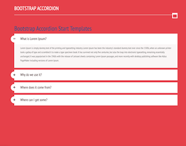
             <h1><a href="https://starttemplates.com/product/bootstrap-accordion/">Bootstrap Accordion Start Templates</a></h1>
            <div class="panel-group" id="accordion" role="tablist" aria-multiselectable="true">
                <div class="panel panel-default">

                    <div class="panel-heading" role="tab" id="headingOne">
                        <h4 class="panel-title">
                            <a class="first" role="button" data-toggle="collapse" data-parent="#accordion" href="#collapseOne" aria-expanded="true" aria-controls="collapseOne">
                                What is Lorem Ipsum?
                                <span> </span>
                            </a>
                        </h4>
                    </div>
                    <div id="collapseOne" class="panel-collapse collapse in" role="tabpanel" aria-labelledby="headingOne">
                        <div class="panel-body">
                            <p>Lorem Ipsum is simply dummy text of the printing and typesetting industry.
                                Lorem Ipsum has been the industry's standard dummy text ever since the 1500s,
                                 when an unknown printer took a galley of type and scrambled it to make a type specimen book.
                                  It has survived not only five centuries, but also the leap into electronic typesetting,
                                  remaining essentially unchanged. It was popularised in the 1960s with the release of
                                  Letraset sheets containing Lorem Ipsum passages, and more recently with desktop publishing
                                  software like Aldus PageMaker including versions of Lorem Ipsum.</p>
                        </div>
                    </div>
                </div>

                <div class="panel panel-default">
                    <div class="panel-heading" role="tab" id="headingTwo">
                        <h4 class="panel-title">
                            <a class="collapsed" role="button" data-toggle="collapse" data-parent="#accordion" href="#collapseTwo" aria-expanded="false" aria-controls="collapseTwo">
                                Why do we use it?
                                <span> </span>
                            </a>
                        </h4>
                    </div>
                    <div id="collapseTwo" class="panel-collapse collapse" role="tabpanel" aria-labelledby="headingTwo">
                        <div class="panel-body">
                            <p>It is a long established fact that a reader will be distracted by the readable content
                                 of a page when looking at its layout. The point of using Lorem
                                  Ipsum is that it has a more-or-less normal distribution of letters,
                                   as opposed to using 'Content here, content here', making it look like readable English.
                                   </p>
                            <img src="image//girl.jpg" width="300">
                        </div>
                    </div>
                </div>

                <div class="panel panel-default">
                    <div class="panel-heading" role="tab" id="headingThree">
                        <h4 class="panel-title">
                            <a class="collapsed last" role="button" data-toggle="collapse" data-parent="#accordion" href="#collapseThree" aria-expanded="false" aria-controls="collapseThree">
                                Where does it come from?
                                <span> </span>
                            </a>
                        </h4>
                    </div>
                    <div id="collapseThree" class="panel-collapse collapse" role="tabpanel" aria-labelledby="headingThree">
                        <div class="panel-body">
                            <p>Contrary to popular belief, Lorem Ipsum is not simply random text.
                                 It has roots in a piece of classical Latin literature from 45 BC,
                                 making it over 2000 years old. Richard McClintock, a Latin professor
                                 at Hampden-Sydney College in Virginia, looked up one of the more obscure
                                 Latin words, consectetur, from a Lorem Ipsum passage.</p>
                        </div>
                    </div>
                </div>
                <div class="panel panel-default">
                    <div class="panel-heading" role="tab" id="headingThree">
                        <h4 class="panel-title">
                            <a class="collapsed last" role="button" data-toggle="collapse" data-parent="#accordion" href="#collapseThree" aria-expanded="false" aria-controls="collapseThree">
                                Where can I get some?
                                <span> </span>
                            </a>
                        </h4>
                    </div>
                    <div id="collapseThree" class="panel-collapse collapse" role="tabpanel" aria-labelledby="headingThree">
                        <div class="panel-body">
                            <p>There are many variations of passages of Lorem Ipsum available,
                                but the majority have suffered alteration in some form, by injected humour,
                                or randomised words which don't look even slightly believable.
                                If you are going to use a passage of Lorem Ipsum, you need to be sure there isn't
                                anything embarrassing hidden in the middle of text.</p>
                        </div>
                    </div>
                </div>
            </div>
        </div>
    </div>
</div>
CSS code
This is the css code used to create this bootstrap snippet, You can copy and paste the following css code inside a page with bootstrap 3.2.0 included, to get the result that you can see in the preview selection
Downloadbody{
margin-top: 50px !important;
background: #F15A5C;
font-family: 'PT Sans Narrow', sans-serif;
}
a:hover, a:focus{
text-decoration: none !important;
outline: none !important;
}
.panel-group .panel{
background-color: #fff;
border:none;
box-shadow:none;
border-radius: 10px;
margin-bottom:11px;
}
.panel .panel-heading{
padding: 0;
border-radius:10px;
border: none;
}
.panel-heading a{
color:#816d6d !important;
display: block;
border:none;
padding:20px 35px 20px;
font-size: 20px;
background-color:#fff;
font-weight:600;
position: relative;
color:#fff;
box-shadow:none;
transition:all 0.1s ease 0;
}
.panel-heading a:after, .panel-heading a.collapsed:after{
content: "\f068";
font-family: fontawesome;
text-align: center;
position: absolute;
left:-20px;
top: 10px;
color:#816d6d !important;
background-color:#fff;
border: 5px solid #fff;
font-size: 15px;
width: 40px;
height:40px;
line-height: 30px;
border-radius: 50%;
transition:all 0.3s ease 0s;
}
.panel-heading:hover a:after,
.panel-heading:hover a.collapsed:after{
transform:rotate(360deg);
}
.panel-heading a.collapsed:after{
content: "\f067";
}
#accordion .panel-body{
background-color:#fbf8f8;
color:#8C8C8C;
line-height: 25px;
padding: 10px 25px 20px 35px ;
border-top:none;
font-size:14px;
position: relative;
}
.text-white{
color:white;
text-transform: uppercase;
}
.loader {
display: inline-block;
width: 30px;
height: 30px;
position: relative;
border: 4px solid #Fff;
top: 50%;
animation: loader 2s infinite ease;
}
.loader-inner {
vertical-align: top;
display: inline-block;
width: 100%;
background-color: #fff;
animation: loader-inner 2s infinite ease-in;
}
@keyframes loader {
0% {
transform: rotate(0deg);
}
25% {
transform: rotate(180deg);
}
50% {
transform: rotate(180deg);
}
75% {
transform: rotate(360deg);
}
100% {
transform: rotate(360deg);
}
}
@keyframes loader-inner {
0% {
height: 0%;
}
25% {
height: 0%;
}
50% {
height: 100%;
}
75% {
height: 100%;
}
100% {
height: 0%;
}
}
About this bootstrap example/template
This example/template, Bootstrap accordion Start Templates, was published on Mar 15th 2019, 02:53 by Ravi Sharma and it is free.
We hope you will enjoy this awesome snippet and stay tuned for the latest updates, bootdey snippets are already used in thousands of blogs, websites and projects. We believe it will save your precious time and gives trendy look to your next web project.
We always try to offer the best beautiful and responsive source of Bootstrap code examples and components.
This code example currectly have 10.2K views, Using this bootstrap snippet you have the following benefits:
Bootstrap 3.2.0
<link rel='stylesheet' href='https://netdna.bootstrapcdn.com/bootstrap/3.2.0/css/bootstrap.min.css'>
<script src='https://netdna.bootstrapcdn.com/bootstrap/3.2.0/js/bootstrap.min.js'></script>
This code example is based on bootstrap 3.2.0 and the grid system of this framework
Responsive
Based on bootstrap framework makes all the layouts perfectly responsive for all devices
Crossbrowser compatibility
Tested on all major browsers, it works smoothly on all of them
semantic html 5
Built on html / css3 the code quality is really amazing
Simple Integration
This code example can be simply integrated on existing sites and new ones too, all you need to do is copy the code and start working
