HTML code
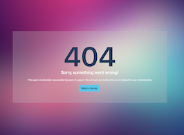
This is the html code used to create this bootstrap snippet, You can copy and paste the following html code inside a page with bootstrap 5.1.3 included, to get the result that you can see in the preview selection
Download<section class="p-0 bg-img cover-background" style="background-image: url(https://bootdey.com/img/Content/bg1.jpg);">
<div class="container-fluid d-flex flex-column">
<div class="row align-items-center justify-content-center min-vh-100">
<div class="col-md-9 col-lg-6 my-5">
<div class="text-center error-page">
<h1 class="mb-0 text-secondary">404</h1>
<h2 class="mb-4 text-white">Sorry, something went wrong!</h2>
<p class="w-sm-80 mx-auto mb-4 text-white">This page is incidentally inaccessible because of support. We will back very before long much obliged for your understanding</p>
<div>
<a href="#" class="btn btn-info btn-lg me-sm-2 mb-2 mb-sm-0">Return Home</a>
</div>
</div>
</div>
</div>
</div>
</section>CSS code
This is the css code used to create this bootstrap snippet, You can copy and paste the following css code inside a page with bootstrap 5.1.3 included, to get the result that you can see in the preview selection
Downloadbody{margin-top:20px;}
.cover-background {
position: relative !important;
background-size: cover !important;
overflow: hidden !important;
background-position: center !important;
background-repeat: no-repeat !important;
}
.p-0 {
padding: 0!important;
}
section {
padding: 120px 0;
overflow: hidden;
background: #fff;
}
.error-page {
background-color: #BABABA4A;
-webkit-backdrop-filter: blur(9px);
backdrop-filter: blur(15px);
border: 1px solid rgba(234,234,235,0.2);
padding: 80px 20px;
}
.text-center {
text-align: center!important;
}
.error-page h1 {
font-size: 200px;
line-height: 1;
font-weight: 600;
}
.text-secondary {
color: #15395A !important;
}
.mb-4 {
margin-bottom: 1.5rem!important;
}
About this bootstrap example/template
This example/template, 404 error page with blur, was published on Mar 3rd 2022, 08:10 by Bootdey Admin and it is free.
We hope you will enjoy this awesome snippet and stay tuned for the latest updates, bootdey snippets are already used in thousands of blogs, websites and projects. We believe it will save your precious time and gives trendy look to your next web project.
We always try to offer the best beautiful and responsive source of Bootstrap code examples and components.
This code example currectly have 10.8K views, Using this bootstrap snippet you have the following benefits:
Bootstrap 5.1.3
<link rel='stylesheet' href='https://cdn.jsdelivr.net/npm/[email protected]/dist/css/bootstrap.min.css'>
<script src='https://cdn.jsdelivr.net/npm/[email protected]/dist/js/bootstrap.bundle.min.js'></script>
This code example is based on bootstrap 5.1.3 and the grid system of this framework
Responsive
Based on bootstrap framework makes all the layouts perfectly responsive for all devices
Crossbrowser compatibility
Tested on all major browsers, it works smoothly on all of them
semantic html 5
Built on html / css3 the code quality is really amazing
Simple Integration
This code example can be simply integrated on existing sites and new ones too, all you need to do is copy the code and start working
