HTML code
This is the html code used to create this bootstrap snippet, You can copy and paste the following html code inside a page with bootstrap 3.3.7 included, to get the result that you can see in the preview selection
Download<div class="container-fluid">
<div class="row">
<div class="profile-head">
<div class="profiles col-xs-8 col-xs-push-2 col-sm-10 col-sm-push-1 thumbnail">
<div class="col-md-3 col-sm-3 col-xs-12">
<div class="row">
<img src="https://bootdey.com/img/Content/avatar/avatar6.png" class="img-responsive" />
</div>
</div>
<div class="col-md-9">
<div class="row">
<span class="col-sm-12"><h5>John Doe</h5></span>
<div class="col-md-4 col-sm-6 col-xs-12">
<p>Web Designer / Develpor </p>
<ul>
<li><span>Lorem ipsum</span></li>
<li><span>Lorem ipsum</span></li>
<li><span>Lorem ipsum</span></li>
<li><span>Lorem ipsum</span></li>
</ul>
</div>
<div class="col-md-4 col-sm-6 col-xs-12">
<p>Web Designer / Develpor </p>
<ul>
<li><span>Lorem ipsum</span></li>
<li><span>Lorem ipsum</span></li>
<li><span>Lorem ipsum</span></li>
<li><span>Lorem ipsum</span></li>
</ul>
</div>
</div>
</div>
</div>
</div>
</div>
</div>CSS code
This is the css code used to create this bootstrap snippet, You can copy and paste the following css code inside a page with bootstrap 3.3.7 included, to get the result that you can see in the preview selection
Downloadbody {
background: #ddd;
}
.page-header {
background: #00bcd4;
margin: 0;
}
.profile-head {
height: 400px;
width: 100%;
background-color: #00bcd4;
float: left;
position: relative;
}
.profile-head img {
margin: 0 auto;
border-radius: 5px;
max-width: 100%;
width: 100%;
}
.profile-head h5 {
width: 100%;
padding: 5px 5px 0px 5px;
text-align: justify;
font-weight: bold;
color: #555;
font-size: 25px;
text-transform: capitalize;
margin-bottom: 0;
}
.profile-head p {
width: 100%;
text-align: justify;
padding: 0px 5px 5px 5px;
color: #555;
font-size: 17px;
text-transform: capitalize;
margin: 0;
}
.profile-head a {
width: 100%;
text-align: center;
padding: 10px 5px;
color: #555;
font-size: 15px;
text-transform: capitalize;
}
.profile-head ul {
list-style: none;
padding: 0;
}
.profile-head ul li {
display: block;
color: #555;
padding: 5px;
font-weight: 400;
font-size: 15px;
}
.profile-head ul li:hover span {
color: rgb(0, 4, 51);
}
.profile-head ul li span {
color: #555;
padding-right: 10px;
}
.profile-head ul li a {
color: #555;
}
.profile-head h6 {
width: 100%;
text-align: center;
font-weight: 100;
color: #555;
font-size: 15px;
text-transform: uppercase;
margin-bottom: 0;
}
.profiles {
top: 300px;
}
/*media query*/
@media all and (max-width:768px) {
a.menu {
display: block !important;
margin: 9px 2px;
float: right;
color: rgba(255, 102, 0, 0.98);
border: 0px solid;
background: none;
font-size: 30px;
width: 27px;
position: relative;
cursor: pointer;
}
a.menu:hover,
a.menu:focus {
color: rgb(0, 4, 51);
}
.drop_menu1 {
display: block;
visibility: visible;
width: 250px;
height: 1000px;
padding: 5px 30px;
position: absolute;
right: 0 !important;
background-color: #ffffff !important;
transition: all ease 0.5s;
border-top: 0px solid;
cursor: pointer;
}
}
@media all and (max-width:430px) {
.profile-head ul li {
font-size: 12px !important;
}
.bio-table>tbody>tr>td {
font-size: 13px;
}
}
About this bootstrap example/template
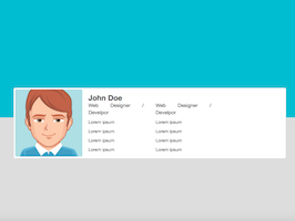
This example/template, Profile card with header, was published on Jun 26th 2017, 00:03 by Bootdey Admin and it is free.
We hope you will enjoy this awesome snippet and stay tuned for the latest updates, bootdey snippets are already used in thousands of blogs, websites and projects. We believe it will save your precious time and gives trendy look to your next web project.
We always try to offer the best beautiful and responsive source of Bootstrap code examples and components.
This code example currectly have 13.1K views, Using this bootstrap snippet you have the following benefits:
Bootstrap 3.3.7
<link rel='stylesheet' href='https://netdna.bootstrapcdn.com/bootstrap/3.3.7/css/bootstrap.min.css'>
<script src='https://netdna.bootstrapcdn.com/bootstrap/3.3.7/js/bootstrap.min.js'></script>
This code example is based on bootstrap 3.3.7 and the grid system of this framework
Responsive
Based on bootstrap framework makes all the layouts perfectly responsive for all devices
Crossbrowser compatibility
Tested on all major browsers, it works smoothly on all of them
semantic html 5
Built on html / css3 the code quality is really amazing
Simple Integration
This code example can be simply integrated on existing sites and new ones too, all you need to do is copy the code and start working

